
-
Posts
6,920 -
Joined
-
Last visited
-
Days Won
21
Everything posted by Starship Krupa
-
The extra line was trying to convey "this opens multiple buses rather than a single panel" Silly, perhaps, but it seemed like a good idea at the time. I got into examining UI design due to theming, so some of it's kind of just playing around.
-

theme Tungsten_Slate (updated 2021.12)
Starship Krupa replied to Colin Nicholls's topic in UI Themes
Unfortunately, we have only so many pixels to work with. -
I hear ya about the consistency, but to me, they're different contexts. The Finder/Explorer convention is that the t-t's are used on the left side to open subfolders. So in my way of thinking, okay, we're opening subfolders, and the button for that is on the left side, so, turny triangles. When I tried using them anywhere else (except ProChannel), it didn't look right, so I backed it out. In any case, the arrow is an improvement over the +/- for sure. Much easier to see. Hmm, there's gotta be some way to have that Drop button be something that's consistent (rather than being the only burger in the UI) yet not a down arrow, which as you point out, is used to signify opening and closing panels. I will meditate on this.
-
Looks great! I like your solution to the "play row" button fakeout issue in Step Sequencer. The only thing I don't care for is leaving Global/Drop unchanged (as a down arrow). I like the 3-bar hamburger, but if you don't care for that, maybe there's another symbol that will fit better? Probably an oversight: your Mix Module PDC buttons are stock. I like what you did with the FX button, seems like that would work for PDC. Feel free to swipe my 1X/2X button for upsampling. I make cell #4 of Step Sequencer/Play into a "stop" button (which is the same convention Cakewalk uses in Media Browser). Also, in places where a preset can be deleted, like Plug-in Properties and Media Browser, I like to show a "-" rather than an "x." (I see now that I missed that on some of mine so I'll touch them up). Re: up and down arrows vs. turny triangles on the folders. My thoughts on it are if they were canonical, I'd solidly prefer turny triangles. I'll use them until I see something I like better. Either is better than the stock "+/-."
-
I don't know that any new art would need to be created rather than copied from Blue Ice and one of your themes (depending on where you want to get your Pre/Post and Mix Module images). Yeah, start with Blue Ice and do a flurry of "Removes." Depending on taste, I also duded up the otherwise blah (to me) Matrix and Step Sequencer Views and you can use that if you like. The only thing I can think of that someone might object to is my arrows. I do like them big. (It was hard for me not to do just a few color changes, like Alt Text 2 and Ruler Digits but I resisted temptation)
-
Oh dear, apologies! Should be okay now.
-
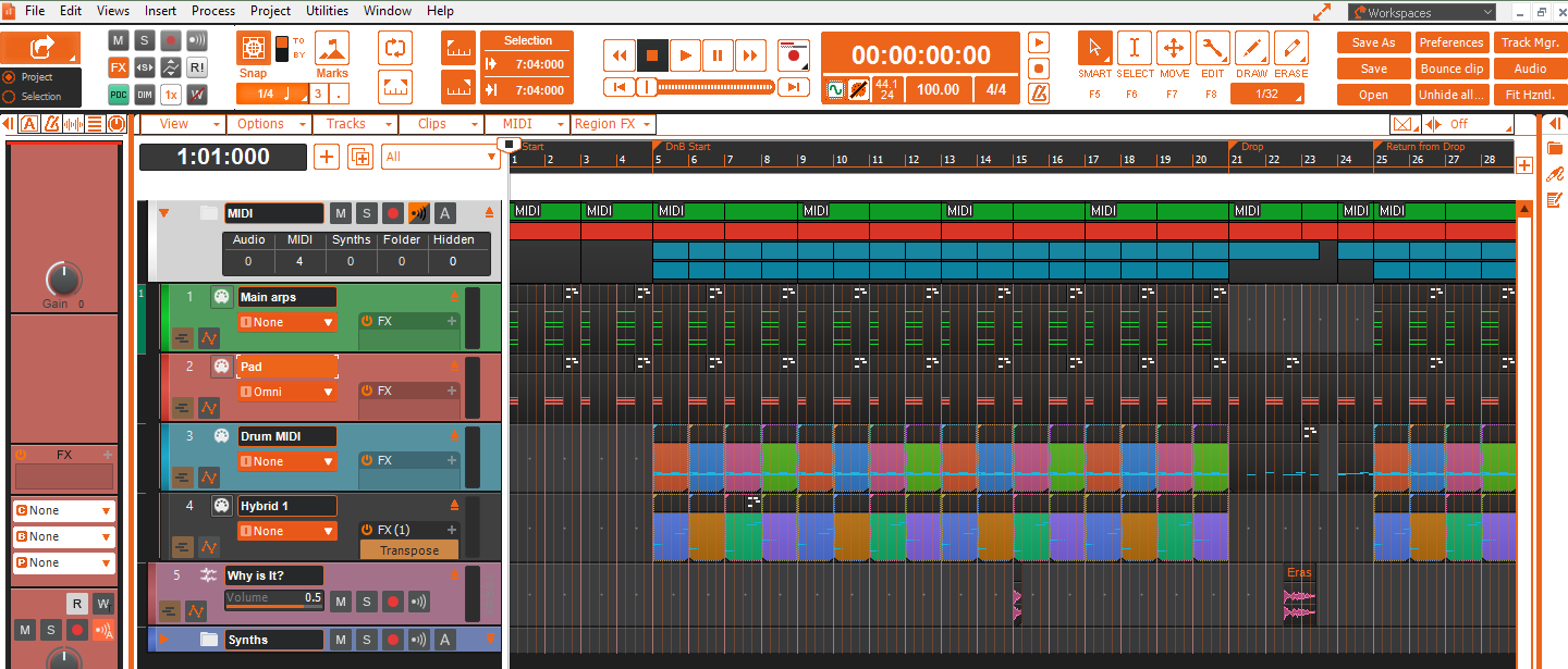
Per a suggestion by @Colin Nicholls, I've created a new custom theme, Tungsten RS. The "RS" means "revised standard," so named by Colin in reference to the popular Bible translation. It starts with Tungsten and stays there color-wise, but implements the same icon and button conventions that I use in all of my other themes. Several of these are what I consider "fixes" to the standard program. For example my buttons for Pre and Post are labeled "Pre" and "Post" (or "Pst" as the case may be) rather than having "Pre" be indicated by the word "Post" in greyed state. In the Mix Module, the state of FX or PDC being disabled is indicated by a red slash across the button rather than having "brightly colored" signify "disabled" while greyed out signifies that those things are active. For the most part, lit up means "on," whereas in some places in the stock Cakewalk UI, lit up means that bypass is engaged. The plug-in upsampling button says "1X" when there is no upsampling, and "2X" when upsampling is engaged. That kind of thing. Once you get used to it, which takes about 30 seconds, you'll likely not want to go back. It's stuff that IMO, should someday make it into the product, but hasn't for whatever reason. For the remaining stuff, if you like my expand and close buttons, my Browser and Inspector show, hide, undock, and options buttons, but you like good ol' Tungsten better than the idiosyncratic color combinations I've come up with, this is your theme. Or you can swipe my art and use it in your own custom theme, it's all in good fun. Oh, also, the grid lines in PRV stand out better in this one than in standard Tungsten. And I fixed the art in the Arpeggiator so that it no longer looks like poo (really, load Tungsten, set a track color to lime green and look at the Arpeggiator, it's awful).
-
Step Sequencer expand row header button looks like "Play"
Starship Krupa replied to Starship Krupa's topic in UI Themes
Another one for the list: swapping the "x" of Remove Take Lane for the "-" of Remove Automation Lane. -
Step Sequencer expand row header button looks like "Play"
Starship Krupa replied to Starship Krupa's topic in UI Themes
P.S., I think the Mercury/Tungsten Revised Standard Edition is a great idea. I can do up the Tungsten if you want to take Mercury. There are lots of swipeables in Blue Ice that could drop right in. Blue Ice uses the same blue that Mercury does. For Tungsten-based themes, there are other little tweaks like clearer grid lines in the Piano Roll and darkening selected clip backgrounds so that it's easier to see which ones are selected. -
Step Sequencer expand row header button looks like "Play"
Starship Krupa replied to Starship Krupa's topic in UI Themes
Swipe away, mate. I consider image swipes from my themes to be high compliments. Also adding "Markers" to the Markers Module! The YLIP open padlock is incorporated everywhere there's a padlock in my themes. Arpeggiator, for instance. As far as iconography, I've gone with +/- in places where something is being added or deleted, X in places where something is being closed or cleared, adding a bar or bars to arrows that open panels, the turning triangle for panel expansion wherever appropriate, and no double arrows. I like to use as much of the arrow buttons' pixels as possible for greater visibility. Why would adding text to the Record button be controversial? Localization issue? I've backed off from adding text to buttons for that reason. Man, I would love to see or come up with a better way to indicate in/out of phase. I understand that in the Cakewalk visual language, grey=in phase, but if there were some more definitive way to show it, I'd like that. Here's what my current folder iconography looks like. Turny triangle to the left to open the folder, and arrow-with-bar to the right to expand and contract the header: It's not perfect, but given the constraints of having to overlay an existing UI, it's the best I could come up with. I like it better than the +/- for opening the folder, because to me, +/- means I'm adding or deleting something. Also, the stock tiny "+" is hard to see.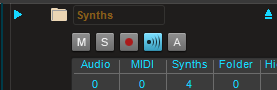
-
theme Tungsten_Slate (updated 2021.12)
Starship Krupa replied to Colin Nicholls's topic in UI Themes
I just installed the latest and notice that you haven't implemented the obligatory Synth/Instrument track icon swap. Also: love what you've done with the zoom buttons. -
Step Sequencer expand row header button looks like "Play"
Starship Krupa replied to Starship Krupa's topic in UI Themes
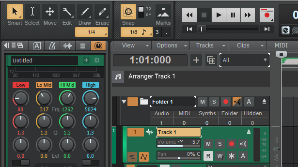
The Browser buttons get messed up on changing theme. The way to shake it off is to click the Plug-ins tab. This is my current form of Dock, Drop, and Dockbar buttons: As you see, the "docking options" button is the "hamburger," a widely recognized icon for "options," the "Dockbar Left" button is a large single arrow with a bar to indicate that a panel will be closing or opening. I've also made the "dock" button as large as it could be for better visibility. The "docking options" button just had to go. Initially it looked weird next to the Track Inspector tab, whose stock icon is also the hamburger, so I made the Track Inspector icon a Big Mac, with 4 lines. I've gotten so used to my own themes with their customized buttons that the stock stuff looks odd to me. I guess that's a risk of customizing something to be the way I want it.
-
Can you share which ones did the trick? I recommend to all that they exclude their plug-in folders, project folders, sample folders, and the Cakewalk program folder. I run with Defender realtime scanning turned off completely, but I still sometimes get the slow opening Themes (although it's only a matter of seconds) and keyboard shortcuts. Not every time, just sometimes.
-
My first release as Superabbit! https://superabbit.bandcamp.com/track/sensation DAW: Cakewalk Instruments used: Hybrid 3, Iris2, Boom, A|A|S Masala FX: Meldaproduction, elysia, Valhalla, T-Racks, Cymatics, Unfiltered Audio, Lindell
-
Step Sequencer expand row header button looks like "Play"
Starship Krupa replied to Starship Krupa's topic in UI Themes
MacOS Finder and Windows Explorer have been doing it that way for decades. Like it or not, it's a modern UI standard. Cakewalk does it that way in other locations as well. The Add Track flyout is the first that comes to mind. My themes also use it for opening and closing folders. I've updated all of my themes to make it more clear. -
Easier on the theme maker as well; I have 6 of them. I think what I'm going to start doing is that for the "updated for 2021.12" type, I'll just use an omnibus post, but continue with individual ones when my themes get individual updates. I'll post links to the individual themes' threads in the omnibus post.
-
It The VST3 version appears to be non-functional for the great mass of people who have tried to use it, me included. VST2 okay, if you need another tubeifier.
-
Step Sequencer expand row header button looks like "Play"
Starship Krupa posted a topic in UI Themes
This issue was pointed out by @Kevin Perry: the turny triangle arrow buttons you click on to expand a row look like little "play buttons" that are supposed to actually play the notes in the row. I concur. Fortunately, the issue is easily addressed via Theme Editor and small changes to 3 images. All that needs to be done is make the #4 cells of Step Sequencer/Expand Row and #1 cell of Step Sequencer/Collapse row triangle/arrows have a transparent background. With no background, they have no rectangle surrounding them, and so look like what they're supposed to be: arrows that indicate the state of a collapsible view. The next thing is that you need to edit Step Sequencer/Track Control Background (selected) to lighten the square where the button is superimposed. Make it the same lighter shade as the area just to the left give it all one look: With those changes, the turny triangles will not look so much like "Play" buttons. Observe the effect on Blue Ice: I will be uploading new versions of all of my themes in the next 24 hours to include these changes.
-
Launchpad not connecting to Sonar X3
Starship Krupa replied to uncle peri's topic in Cakewalk by BandLab
Have you tried it with Cakewalk by BandLab? The handling of MIDI ports has been improved since the days of SONAR X3. -
Fix Plugin Manager, which has been broken for decades now.
Starship Krupa replied to Daniel Russell's topic in Feedback Loop
You can only examine plug-in properties, such as install location, from PIM. Also change certain properties. -
Instruments You Really Tried To Like, but...
Starship Krupa replied to dubdisciple's topic in Instruments & Effects
My vote goes to Surge. Love the background and history, commercial-to-open source, all of that, but I just can't find or create usable sounds with the thing. I always wind up going back to Hybrid 3 or Vacuum Pro and getting what I want very quickly. The Orchestral Companions were a great way to get orchestra sounds for cheap 5 years ago, but since Orchestools came out for free, and is a better product both in their own ROMplers and as Sampletank libraries, I don't use them much anymore. -
An RCA input jack is almost certain to be a low impedance line input. Before you purchase a breakout assembly, make sure that it has what you want, which is an instrument input suitable for guitar. For instance, my PreSonus Firepods have 8 1/4" inputs on the front. 2 of them are mic/line/instrument and the other 6 are mic/line only. I can plug my guitar into the mic/line inputs, but it will have a low level and have that weird "low impedance load" feel when I play. So you don't just need a 1/4" input, you need one designed to accept a guitar signal. I suggest that you just buy a boost pedal like this one: https://smile.amazon.com/AmazonBasics-Boost-Guitar-Effect-Pedal/dp/B07ZVZFLZ1/ Go to Amazon and search for guitar boost pedal and many will come up in the under $40 range. The Amazon Basics one is sold under a few different brand names. It will take care of your level/impedance matching and be useful for other things as well, like overdriving the front end of an amplifier.
-
I was working in the Lab.... now I present: Orange Frappe
Starship Krupa posted a topic in UI Themes
It's a tribute to BandLab, one of the most stand-up companies in the music biz. A frappe is a tasty frozen beverage popular in Boston, Cakewalk's city of origin. It's a very bright theme. I use dark themes (switching between Midnight Blue, Racing Green and EVA01) but I like to make themes and this mostly very light one was a fun challenge. It has the standard SK buttons, nothing that's new if you're familiar with my themes, it's the BandLab colors that set this one apart. As usual, poke about and see if you find any Easter Eggs. The wallpaper is nice, not that we see it that much. As always BE SURE to download and install the color preset, too, as I don't consider my themes complete without them. Download link is in my sig.
-
Gate Plugin for Vocals similar to "Sonnox Drug Gate"
Starship Krupa replied to Gregg Markus's topic in Production Techniques
What does the Drug Gate do that's so special? Does it gate only certain frequencies? Boz Digital's Gatey Watey does that, and has been on every live kit snare and kick since I got it years ago. Cockos' REAFir (free for any host as part of their package of REAPlugs) can be used to gate out specific frequencies or ranges of frequencies. I had a camcorder video where the person holding the camera was also playing cowbell and managed to mostly tame the cowbell with REAFir. REAFir has other very handy tricks up its sleeve. I think it may get overlooked because it's both free and has been around for a long time, but it is a powerful tool. -
You don't say what model RME you have, but the first question to ask is whether it has a Line/Instrument input jack. Although the guitar cable's 1/4" plug will fit the typical audio interface line input, you will get bad performance from plugging an electric guitar straight into a line input. A standard electric guitar's pickup doesn't output enough level to drive a line input, and a line input typically has a much lower impedance than an electric guitar wants to operate into. Both of these add up to low, noisy signal. The impedance mismatch can make the playing feel of the guitar weird, like you're trying to force the notes through the wire. We have a winner. The biggest issue is the impedance mismatch, so the thing is you need to plug your guitar into something that's made to accept an electric guitar output, and maybe give it a little boost, too. The most basic guitar preamp pedal will do.