
-
Posts
8,620 -
Joined
-
Last visited
-
Days Won
30
Everything posted by Starship Krupa
-

documentation Young Lady's Illustrated Primer to Theming Cakewalk
Starship Krupa replied to Colin Nicholls's topic in UI Themes
One for Plug-In Property Page, should you wish to include it. For Preset Name drop-down menu, the first cell in the image is its standard state, the second is what's displayed after the user double clicks on it to change the preset name. It persists until the preset is saved. Whatever color you use for both cells should have good contrast with View Menu Text. -
The solution I'd be looking for is how to prevent Cakewalk from crashing. Make notes of what is going on when it crashes, ask here in the forum and/or with tech support?
-
The description as "unique" is kinda funny. Vojtech himself has said that it's a clone of Gross Beat, of course with extended functionality. Everything in their product descriptions is fiery hyperbole, though. $22 is a great price. If you're into things like Stutter Edit, this covers similar ground, and more.
-
Theme: Yellow Submarine (updated for 2021.12)
Starship Krupa replied to Starship Krupa's topic in UI Themes
Thank you so much, John. I do have the one theme that's my "fade into the background theme," Racing Green, but yeah, the "bold" is fun. I find myself switching back and forth between them even during a session, depending on the task at hand. The bold ones seem to be good for initial inspiration, coming up with chords, beats, and basslines for EDM, and then for the more technical tasks of editing, comping, and mixing, I switch back to the soothing green. And speaking of switching back and forth, when I switch over to Mercury and Tungsten, I'm reminded of how much a custom theme (and color preset) can improve upon them by adding contrast. This is especially true in the Track Pane and Piano Roll, where I like to have brighter gridlines and more contrast between foreground and background. -
documentation Young Lady's Illustrated Primer to Theming Cakewalk
Starship Krupa replied to Colin Nicholls's topic in UI Themes
In a nutshell, what I figured out was that those images just indicate which plug-in UI has focus, regardless of ACT. So they should indicate it as such by being lighter or a different colour. It's a useful indicator in cases where you're controlling plug-ins with the computer keyboard or whatever. As you know, once I started fiddling with those images it opened a can o'worms with all the different images. I changed a couple of them, and it was like trying to put toothpaste back in the tube to back out, so I forged onward. It helps to have Amazon Prime Video running on monitor 2. -
Theme: Yellow Submarine (updated for 2021.12)
Starship Krupa replied to Starship Krupa's topic in UI Themes
In addition to multiple adjustments for the sake of consistency and legibility, we've also added more visual whimsy. Here's some more work on the Transport Module: And faders: And what you get if you don't lock your Control Bar Modules:
-
documentation Young Lady's Illustrated Primer to Theming Cakewalk
Starship Krupa replied to Colin Nicholls's topic in UI Themes
I've been fiddling about with the images used in FX Rack, and I have a suggestion for an addendum to YLIP p. 38-39, if you care to. Details about what "ACT Focus" means, which is that it's the effect plug-in that currently has Cakewalk's attention or "focus," whether one is using ACT or not. It tripped me up because I thought it only applied when an ACT controller was enabled, but as it turns out, Cakewalk always lets you know (via switching these images) what plug-in has focus. And a plug-in can have focus and be bypassed at the same time. Also, as far as I could tell, the middle cell (or cell 2, "pressed") of Open Plug-In UI (in all its forms) isn't used because it seems to switch over to the appropriate Name Background (ACT Focus) image as soon as I press it. As I say, "as far as I could tell." This is about the trickiest area for sorting out button states. There's enabled, bypassed, focused, unfocused, regular, narrow, plus the hover and pressed states, so I may have it wrong. You must have gone through a lot of coffee figuring this stuff out! -
It's very bright.
-
You are a gentleman and a scholar. Also, I want to especially commend you on your Quadcurve fly-out.
-
Although I usually prefer darker themes, this one really lives up to the light theme paradigm, much more so than Mercury. How about a Custom Color preset to get those "graph paper" lines into the Track Pane?
-
How to tame vocal "I" and "E" sounds?
Starship Krupa replied to user390096's topic in Instruments & Effects
Since you seem open to working on your singing and mic technique, yeah, your voice is an instrument that needs regular practice to maintain a skill level, just like guitar or piano or drums. As far as mixing-related solutions, using the Quadcurve EQ in ProChannel, take the green band, set the Q to about 8, crank the gain up to about 10 and then sweep the frequency knob back and forth until you hit the "ugly" frequency. You'll hear it, it will be the once that grates like chalk on a blackboard. Once you find that unwanted resonance, pull the gain down to -3dB and then fiddle with the Q and gain as necessary to tame it. As with all things mix, take care not to overdo it to the point where there's a frequency hole. I do this for every vocal. To my understanding, it's what happens when your voice and the mic (and maybe some room reflections) form a resonant peak. It can be reduced by learning more singing and mic placement technique. Even if you don't have a vocal booth, you can set up your mic in different places around the room until you find the one that is most flattering/flattening. That's how Sam Philips did it. -
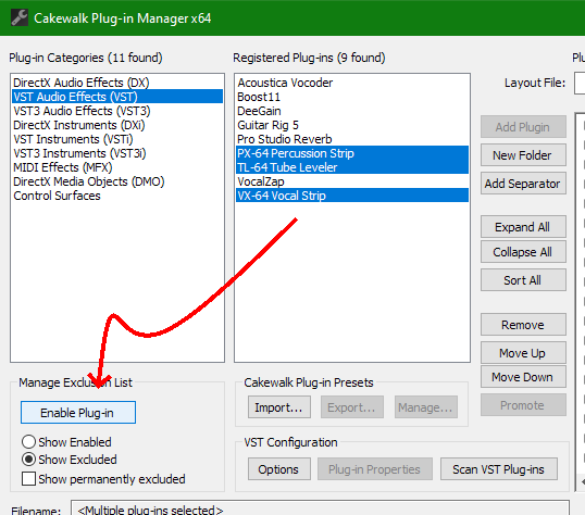
The "hidden treasures" have some useful features. You can enable them using Plug-in Manager as shown:
-
Dang, that is a heckuva bundle of sound design for a negligible amount of money.
-
Make VST3 Presets available from Preset menu
Starship Krupa replied to Starship Krupa's topic in Feedback Loop
Yeah, it doesn't display the name of the preset, and you can't scroll through presets using the arrow buttons either. I thought that Plugin Alliance products were a pain to deal with due to seldom having integral preset systems, then I discovered that no, my PA plug-ins do have presets, in locations that are fully-compliant with the spec. It's just that Cakewalk's preset manager doesn't recognize them. I know that the Cakewalk bakers are proud of how VST3-compliant Cakewalk is, how about implementing this part of the spec? -
The Reference Guide is such a great resource, for users novice and veteran, and as far as I know, the only way to get it, or even know about it, is to come to this forum. I suspect that a majority of new (and maybe veteran) users are not going to immediately come to the forum (if ever) once they run Cakewalk by BandLab. There are multiple helpful links on the Help menu, I suggest adding one that launches the user's default browser and goes straight to the Reference Guide. This way everyone will have access to a 1700-page book on how to use Cakewalk, not just those who venture to the forum.
- 1 reply
-
- 1
-

-
- reference guide
- documentation
- (and 1 more)
-
https://support.izotope.com/hc/en-us/requests/new Has two buttons: "email us" and "Connect with us via social media." I would choose the former. ? Can't blame 'em for trying I guess.
-
loudnessmeter Big Loudness Meter Request
Starship Krupa replied to BAARISH KI DHUN (Pisi Bhaipo)'s topic in Feedback Loop
No prob. It's the one just to the left of the word "LEVELS" in this shot. Good luck!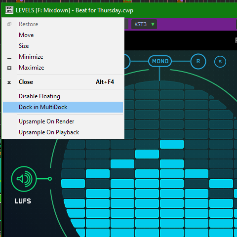
-
1176-alikes have bit me on the booty in years bygone due to inducement of yucky distortion noise when using those very fast attack settings. I had an experience where I was trying to figure out how I had messed up my DI'd bass recording and it turned out that my mistake was running it through an 1176 to even it out. I hadn't solo'd it while setting up the compressor, and then I kept hearing this krrrrkkk sound down in the bass when I put on my headphones. Like a rubbing voice coil, not musical in any way. Even now that I know a lot more about compression I tend not to use attacks below 2 or 3 and that's when I'm really trying to shave an initial transient off something, like a cymbal ping. A compressor whose attack time range starts at a tenth of a mS and goes all the way up to 1.2 mS is not a thing that I easily find uses for. I know I'm peeing into a windstorm of "no way, I'd be lost without my trusty 1176-alike." I fully admit that it's my own lack of experience and skill with them that prevents me from understanding the charm, but I have other options which seem to suit me better. If anyone wishes to enlighten me I welcome it. The usual sources seem to speak in generalities that leave me thinking "well, yes, I get that they can do that, but so will my other compressor that allows me to dial in 5mS and a 5.1:1 ratio if I want to, and it has a threshold knob. " For that matter, I rarely find a use for that other famous flavor, LA/2A emulations. I use my T-Racks 670 for things other people would probably use an LA/2A for (glue and bus leveling), and a versatile precision compressor like MCompressor or MModernCompressor for things that other people would probably use an 1176 for. I used to long for a decent dbx 165 clone, but now I have elysia mpressor which is all that and a side of fries. It rules the danged school on snare and kick at least.
-
Probably this one: https://discuss.cakewalk.com/index.php?/forum/7-instruments-effects/ But it sounds like it didn't actually have anything to do with Cakewalk as such, so who knows. Glad it was resolved. I'd not expect anything more useful than a cute cat picture from a company's Facebook page.
-
Cool, I wasn't even aware that Mixcraft had implemented this. Is it official, or do you just go to the mixrez folder and start editing?
-
Please understand, I didn't initially suggest that Console knob moves be included in the global Undo. If there were a separate queue and menu item for "Mix Undo," that would be just fine with me. The thing to be aware of, It's not all about intentional, strategic moves and wanting to try something then back out of it. It's also (maybe moreso for me) about reversing accidental mouse and wheel movements, which are easy to do. I'm tired, I want to scroll the Console View, and I accidentally roll the wheel while my cursor is over a fader or send knob. Yikes! It doesn't have to be part of the main Undo, that can stay as it is. I would prefer an option that would include mixing moves in the main queue, but witnessing the reaction that the idea provoked in @Noel Borthwick, I stand behind a separate queue 100%. Being used to having those moves included in the other DAW's I use, I take it for granted, but for people used to something different, it doesn't make sense to impose it on them. If the menu were in Console View, all the better.
-
loudnessmeter Big Loudness Meter Request
Starship Krupa replied to BAARISH KI DHUN (Pisi Bhaipo)'s topic in Feedback Loop
Until such time that this feature is implemented, one suggestion is Meldaproduction MLoudnessAnalyzer, a freeware plug-in. Then put it (or whatever meter you prefer) in the Multidock. You do this by clicking on the window icon in the far left upper corner. At this point, your meter plug-in will float on top of everything when Cakewalk has focus. If you need to see Piano Roll or Console on a second monitor, drag their tabs out of the Multidock. -
Start Screen Not Working Since Update **solved**
Starship Krupa replied to dubdisciple's topic in Feedback Loop
Perhaps the Star Screen is waiting in the sky and would like to come and meet us. Probably thinks it would blow our mind, though. I say let the children use it. -
I want to post some musings about the concepts that are behind my themes. I'm also interested to hear from other .STH Lords about what thought processes go into your theme creations. I get the idea that, given the polite lack of enthusiasm shown for my "novelty" themes, EVA 01 and Yellow Submarine, most of the regular posters in this forum have a hard time imagining why anyone would use such "loud" themes. They do get more appreciation on Facebook. There are a few ideas behind them. First, it's a fun challenge for me, to try to capture the feel of a pop culture icon such as the Yellow Submarine. It's taken my themesmanship to a new level. The fist theme I saw that included pop culture references was @Colin Nicholls' Steam Punk, which lit a big lightbulb: a theme doesn't have to solely be about usability, it can also be fun. Steam Punk is a fun theme, it creates a mood. Second, EVA 01 was designed not only with the pop culture source in mind, but also to inspire alertness and focus (which I've been told by a Facebooker that it does). This is a different intention from most themes, where the idea seems to be that the UI should fade into the background. But I don't always want it to fade into the background. When I'm working late at night on EDM, it kind of puts me in the mood to make the bangin' festival beats. Which brings us to.... Third, and this is something that only occurred to me after I got started, if someone's using Cakewalk to play live, a brightly-colored contrasty theme like EVA 01 makes everything more visible, and, if they are projecting their laptop screen so that their moves are visible to the audience, well, that's more visual excitement and coolness. It looks so unusual. I think that Cakewalk with EVA 01 looks more exciting than Ableton Live. As far as I know, the only other DAW that even has the feature of skinning is REAPER. Care to share what thought processes go into your own themes?
-
Favorite Freeware FX Thread
Starship Krupa replied to Starship Krupa's topic in Instruments & Effects
Working fine over here, but I downloaded v.1.0.1 anyway.