

-
Posts
8,666 -
Joined
-
Last visited
-
Days Won
30
Everything posted by Starship Krupa
-
Of course, my answer to everything is a free plug-in, but really, Boz Labs' Panipulator is a nice tool for checking mono compatibility before I finalize (ha ha) a mix. Lets you check everything, mono, L+R swapped, L only, R only, either out of phase, pretty much everything you need to know about how it will sound on the sound system that consists of a 1987 boom box with a single raw car speaker dangling from it by a lamp cord. I've heard that back in the Cakewalk SONAR days it came as a freebie ProChannel module too, but I'll never believe that until someone leaves a copy of the .dll laying around on a Google Drive....
-
Me, too. It doesn't get much simpler than plugging in a pair of headphones. ? Shoot, b, this is all supposed to be in good fun. If your response isn't just roughhousing (it's hard to know in this context), I'm truly sorry if I came off as attacking or too argumentative. I'm a geek, I'm curious about whether my beliefs about sound quality and latency ( that they'll both be better with the Audiophile) are borne out in testing. Not trying to prove that anyone's "right" or "wrong." Noel says that he tests Cakewalk on a system with a Realtek and gets decently low mixing latency, so I'm extra curious (that was not an Appeal To Authority, BTW ?). I agree with almost everything you've said. From where I stand, the only thing we seem to disagree about is at what point the budding recordist should invest $100+ in an audio interface. It's just earlier from your point of view than it is from mine. For you it seems to be ESSENTIAL NOW. For me, it's more "a good idea at some point." From my POV, someone running a rocket sled like that in MME 32 has issues to correct before shelling out for the interface. Numero uno, switch that thing to WASAPI ASAP. Numero dos turned out to be getting NON bluetooth cans. There are multiple reasons why a n00b might want to wait on buying an interface and do it out of expanded needs rather than under pressure of trying to get their system to play back audio smoothly. Maybe they're a young person with little income who just dropped some big coin on that motherboard and RAM and they have to juggle expenditures. Could be that the onboard CODEC was defective and a warranty issue will be uncovered. They advertise the onboard sound as being somehow fancy-pants, so he surely paid something for it. It's not the worst thing in the world for someone to listen to their stuff through a lower-end DAC for a while, get used to how it sounds. Then when they finally pop for the Scarlett (it's always a Scarlett, isn't it?), they can better appreciate the differences. Can we just have a difference of opinion? It doesn't have to descend into virtual fisticuffs when one guy says buy a new interface and another guy says hold on a sec. Does it? Heck, wouldn't a "producer" just download percussion samples? ? I was working on something recently where I was mixing and absently fiddling with one of those plastic LP Egg Shakers, and sure enough, I came up with a rhythm and just HAD to record it, in a continuous take the full length of the track. This when I have a Kontakt library of plastic fruit-shaped shakers, I have samplers and ROMPlers all with beautifully recorded shakers, but as the lord is my witness I rocked that sucker old school into the MXL2001. No edits. I'm like The Doors of plastic egg shakers, just nail that sucker and press it. If someone made a video it could blow up on YouTube: "Watch How This Grey-haired Wannabe 'Producer' Makes a Shaker Track." ?♂️
-

Moving Waves Plugins Between Computers
Starship Krupa replied to Kamikaze's topic in Instruments & Effects
Ugh, the way I manage my Waves licenses is to keep them on a USB stick. Any generic one will do, my WAVES dongle is an old 64M thumb drive and it has about 20 licenses on it. They barely take up any room. If you prefer not to have things poking out of your USB ports, you can still use the stick to transfer the licenses: before decommissioning the old system, move the licenses to a USB stick, then put the stick in your new system and transfer them locally. Having licenses in My License Cloud is fine, you still have access to them, but to use them, you need to either activate them to a USB drive or your local system. "Windows" is the name of your laptop computer. If you have multiple computers, it's good to go into your Windows settings and change their names to something more unique and descriptive, like "Studio" or "Portable" or whatever. If you plan on networking them to each other, it's even necessary. In general, assuming that Waves isn't your only plug-in vendor, do be diligent about going through the rest of your collection and deauthorizing as many of them as you can. IK Multimedia, Plugin Alliance, iZotope, etc. all allow you to deauthorize. I go through my list of plug-ins in the Browser to jog my memory. Things may go better if you update your Waves Central on the laptop to 13.09. Good luck! -
Ooh, moving the goalposts! Well, b, that's where the "not necessarily" comes in. I am 100% with you when it comes to recording live instruments. For recording audio, an external interface is "the price of admission" in my book. For the traditional setup where there's a tower computer sitting there, and the band comes in and records their parts either mic'd or DI'd, any attempt to do that without an interface is doomed. At least in this case, the OP said that they are monitoring on cans. IMO, for entirely ITB production, something like a Scarlett Solo would pretty much act as a big headphone DAC and amplifier dongle. Which is fine if you want that, but where I differ is whether someone needs that for ITB electronic music production. And who said anything about speakers? It's not as if external interfaces automatically come with a pair of powered KRK's. A cable with a 1/8" stereo plug to a pair of RCA's will work fine for connecting to external monitors. I couldn't do as you ask anyway, because the internal speakers in my antique Dell Latitude stopped working even before I sent it on a 2' drop onto concrete. ? I'll play by the OP's rules: 100% ITB, monitoring on cans. And I'll try loading a big mix with multiple synths, audio tracks and FX. Who knows what I'll find out. I have an old M-Audio Audiophile Firewire interface and will hook it up and run some tests, not just latency, but listening quality. I love being surprised. Although I don't love the idea of hauling around a clunky box.
-
b, do you work for Focusrite by any chance? ? I haven't gotten around to it, but at some point I plan to do some experimenting with plugging an external interface into my laptop, using ASIO, and seeing if my mixing and recording latency changes from using the internal CODEC with WASAPI Exclusive. I'll let you know the results in the next "bdickens: you should get an interface with an ASIO driver/Starship Krupa: not necessarily" matchup. And BTW, speaking of Exclusive vs. Shared, on my laptop, I notice a significant difference between them, not only with latency but with sound quality. My ears are sensitive to the transient dulling that can happen when Windows resamples the audio stream, and there seems to be more of that going on with Shared than with Exclusive.
-
Do you mean for each new hack we come up with? Like they each have a counter that goes to 12 template image changes before it stops working? Wouldn't that be a wacky prank to pull on those of us with AD issues? I annotated my post to give you credit, will you be able to rest now? ?I know that those of us attracted to theming and issues like this one tend not to like things that nag at us visually.....
-
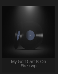
(Actually winkpain didn't say that first, rather he quoted it from sjoens and I quoted it from winkpain's post) Then there's the matter of the seemingly random ones that Cakewalk puts on my Recent Projects. About half of them have the standard screen shot, but then the others have the Mini Moog, the generic icon, or this one, which I guess to differentiate from the gold record, suggests that you will get your song on to vinyl, gold record optional: Looking back over these posts since February, it's astonishing how many times someone has posted saying that they have come up with a method that works 100% of the time. But experience tells me that this only really means it works 100% of the time for them, whether a single other soul is going to be able to get their method to work is anyone's guess. I'm sure that after posting the one I got from Neel, someone will chime in and tell me that nope, doesn't work for them, or maybe it'll stop working for me after a while. I've had that happen, where these methods will work for me for a while, then suddenly for no apparent reason, stop working. Worse than anti-depressant meds in that regard. ?
-
Okay, new information. After trying all of the suggestions in this thread, I still couldn't get it to work reliably. Believe me, I've tried, multiple times. I'm picky about visuals, as a look at the 6 custom Cakewalk themes I've authored will attest. Thanks to the video I'll be linking to at the bottom, I found yet another method, and this one seems to work every time, at least so far. Here are the steps: Choose a PNG image you wish to use for your template's icon Rename it <template name>.cwt.png (for instance "Basic Audio.cwt.png") Place a copy of it in the folder where Cakewalk stores your templates. Save your project template (if it already exists, open it and save it again, it seems to be during the saving process that Cakewalk looks around for the image file). Voila, next time you hit the Start Screen, your icon should show up. I'll use careful language and say that so far, this doesn't seem to require any keywords or typing over existing filenames or any of the old voodoo. This is new voodoo, and it lets you name your templates whatever you wish. Please try it and let me know what you find. Who would have thought that it would take so long to crack this nut. I'm going to ask Neel (the guy in the video) how on Earth he figured this out. His videos are good in general, too, and feature interesting genres of music not often heard on YouTube tutorial vids.
-
If I click through a Kontakt instrument post and find that it requires full Kontakt, I just reply with "RFK." I consider it doing my part to provide more information for all. I'm fine with iLok, I use both a physical dongle and machine authorization with no hassles. The physical dongle is a great convenience when working on multiple systems. So if someone else is an iLok phobe, it's up to them to raise the alarm.
-
Origin is essential. Especially if you're doing the ambient electronica thing of dropping in dialog samples. It does excellent vinyl and tape emulation. When I got it, it eliminated half a dozen other plug-ins from my collection.
- 1 reply
-
- 3
-

-
It would surprise me to learn that someone hasn't already gone into the chambers and made impulses. Also: anyone remember Bubble Memory? That was supposed to revolutionize everything, replace hard drives and RAM all in one.
-
Phoenixverb VST2 version not stereo!!
Starship Krupa replied to Sidney Earl Goodroe's topic in Instruments & Effects
It's a common misapprehension, fostered by Steinberg, that all VST3's automatically have that feature. Steinberg's pitch says "Instead of always processing input signals, VST3 plug-ins can apply their processing economically and only when it is needed." That's a weaselly-worded statement. What it means is that, along with all of the other new features in the VST3 spec, it's a feature that plug-in and host developers may choose to implement. It's not somehow automatically part of a plug-in just because it's VST3. And, as with most of the other features added to the spec between VST2 and VST3, it can also be implemented by plug-in developers in VST2. As a matter of fact, the only plug-in developer I know of who has implemented the sleep feature implemented it in both their VST3 and VST2 format plug-ins. It's a feature that I would think any plug-in company who had implemented it would advertise, and I've yet to see anyone do this except for that one developer. I agree with you that VST3's are preferred going foward, but only because that's going to be where the better support is in the future, by which I mean more care taken in coding, QA testing, and compatibility. Similar to 32-bit plug-ins. Heh, as I said, I've had it go either way. If the VST3 doesn't work, try the VST2 and vice versa. Kinda silly that developers wouldn't test more with Cakewalk; they don't even have to phone up the company to get a free NFR testing license! -
That depends on what the audio issues are. In this case, buying an Audiobox or Scarlett and continuing to monitor with bluetooth cans in MME would likely result in no improvement whatsoever, so first, they need to switch to WASAPI and hardwired cans. The Superlux 681's would be my choice if on a budget. If willing to spend a little more, Audio Technica ATH-50's or Sony MDR-7506. If the OP is doing completely ITB electronic music, the onboard CODEC should work just fine for monitoring. What MSI says about the onboard sound in that motherboard: "A high fidelity sound experience with exceptional acoustics and realism for studio level headphones." Marketing hype, but the fact that they're at least paying attention to it is good. They even use fancy Chemicon audio grade caps in the amp section. There's been a change in the past several years regarding onboard sound CODEC implementation. Gamers play for hours with headphones on, and game designers spend good money and dev time working on game sound. So the hardware used to drive those headphones can't sound like crap. Which brings up another point for the OP: go into the sound settings and make sure that any enhancements are turned off while you're working in your DAW. They add overhead and interfere with the true sound of your mix. I continue to hold out hope that some fine day, the people who make those onboard CODEC's (Realtek still seems to own the market) will release a truly usable ASIO driver for them. In the meantime, WASAPI usually works well. My 10-year-old laptop with its Intel High Definition hardware CODEC can run some fairly complex projects with multiple instances of A|A|S Player using WASAPI.
-
Where i can find the affordable drum loops sample pack?
Starship Krupa replied to Helen Aoki's topic in Cakewalk by BandLab
Yes, but not the good kind. People who frequent forums tend to form bad impressions of companies whose products are pimped in this fashion. As @bdickens pointed out, there are legitimate subforums on this forum for advertising deals. I've bent the rules a few times in the case of deals on upgrading a certain popular free bundle, but I did it in the spirit of turning my fellow Cakewalk users on to something that I myself use daily and can answer questions about. This hit-and-run posting of ad copy is bad form. Serves nothing but to create ill will. -
Vertical Beat Lines and Vertical Measure Lines are the color settings for grid rules in the Track View. Those colors can't be set in a custom theme, and I find them pretty important. For most other things, I like using custom themes, of which I've made half a dozen for public use. The aforementioned Young Lady's Illustrated Primer is the best resource for anyone wishing to change colors (or even button art) in Cakewalk.
-
Where i can find the affordable drum loops sample pack?
Starship Krupa replied to Helen Aoki's topic in Cakewalk by BandLab
I think your post looks like a shill and I want nothing to do with you or these crappy samples. -
The Freeware Instruments thread is pages long and has enough freeware instruments to keep you busy for a long time. Get Sampletank 4 SE and Native Instruments Komplete Start and those will give you plenty to mess with, then plogue sforzando and its free .sfz banks. Both sforzando and Sampletank come with free Mellotron string samples.
-
Phoenixverb VST2 version not stereo!!
Starship Krupa replied to Sidney Earl Goodroe's topic in Instruments & Effects
It seemed like when VST3 first came out, plug-in developers packaged their plug-ins in that format as an afterthought. Take the code for the VST2 and recompile it for VST3. And the hosts' support for the newer format was....unfinished. This added up to VST2 being my first choice. Then at some point, things changed, most hosts finally supported VST3, and it started to go the other way, it seemed like plug-in developers switched their primary focus to VST3 and VST2 became more the "legacy support" option, so I switched to preferring VST3's during installation. I see VST3 as the "New Coke" of VST. For those who don't remember, a needless change to something that already owned the market because people liked it the way it was. There is practically nothing that VST3 offers that can't or hasn't already been implemented by developers in VST2. For proof, all anyone needs to do is look at the offerings: for all the plug-ins that come in both flavors, the VST3 version functions identically (bugs aside) to the VST2. -
Phoenixverb VST2 version not stereo!!
Starship Krupa replied to Sidney Earl Goodroe's topic in Instruments & Effects
Is there a particular reason you were using the VST2 version? I have the converse issue with Acon Multiply. When I tried the VST3 version, nastiness ensued which was not present with the VST2. Excellent purchase, BTW. Phoenix Stereo is hands down my favorite reverb, part of every template. Most of the time I don't even change to a preset other than the default. This goes against my philosophy of personalizing sounds, but I'm helpless in the face of such a great-sounding reverb. I'd recommend you report it to iZotope, but the original Exponential products seem pretty clearly code-frozen since they changed the branding in the UI. Pity, that, because the colors of the UI's are just fugly. -
Plugin Alliance Halloween Sale: Any Plugin $29.99*
Starship Krupa replied to pseudopop's topic in Deals
Obligatory Meldamoonie suggestion: check out MTuner in the FreeFXBundle and you may never want another tuner. Polyphonic and note-to-MIDI conversion. Most importantly, accurate. -
Plugin Alliance Halloween Sale: Any Plugin $29.99*
Starship Krupa replied to pseudopop's topic in Deals
In the future, all plug-ins will be $29.99. -
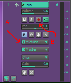
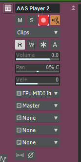
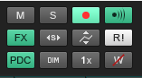
Before you go off and buy an external audio interface hoping it will solve this issue, it is possible to hook an audio interface up to your computer and still accidentally record audio from the computer's built-in mic. External audio interfaces are not necessary for recording MIDI or playing back audio. As soon as you decide you do want to record audio, that's when you'll want to have a good external interface. The only way to record from an audio source to a Cakewalk track is to set that track's input to that audio source, arm the track for recording, and then either hit "R" for record or click on the record button in the Transport module. As in the following diagram, arrow "A" points to where you set the track's input, and "B" points to the button for arming it for recording: In the above example, when button "B" is pressed, Cakewalk will be ready to record audio from the first channel of my audio interface as soon as I hit record. If the track's input isn't set to the internal mic, or the track isn't armed for recording, audio from the mic won't get recorded. When you say that you "activate a track," what do you mean by that? Do you mean arm it for recording? If so, then simple, don't arm an audio track with its input set for the internal mic. If you wish to record MIDI information from your Yamaha keyboard to an Instrument track in Cakewalk, you should arm only that Instrument track for recording, as below: In my case, the input is set to be the MIDI input on my interface. Cuation: If you use the Record button in the Control Bar Mix module to arm your tracks for recording, it will result in all the tracks being armed, so don't do that: Mix module: Only arm the tracks you want to record, do not arm any others. The way to "turn off" the PC mic is just to not have it selected as the audio source for a track that's armed for recording. You could do it on a system level by disabling the mic in your computer's BIOS or in Windows' Device Manager, but we're talking Cakewalk here. The other way to prevent it from showing up as an available audio source in Cakewalk is to go into Preferences/Audio/Input Devices and uncheck the box next to the internal mic: One last note: if you're trying to record the audio that comes out of your Yamaha keyboard, then that is a job for an external audio interface. It's possible to do it using the 1/8" input jack, but few would recommend it.
-
Freeware Instruments Thread
Starship Krupa replied to Starship Krupa's topic in Instruments & Effects
Today's freeware instrument is Sample Science Deep Jupiter, which is, according to their copy, "an analog bass sound module featuring the sound of a famous 80s synthesizer with the name Jupiter in it. The plugin has 8 multi-sampled raw bass suite for electronic genres like synthwave, chillwave, retrowave, and synthpop." -
Favorite Freeware FX Thread
Starship Krupa replied to Starship Krupa's topic in Instruments & Effects
Found a new one today, best freeware find in a while. OZSoft Xpander. It's billed as a stereoizer for making mono sounds into stereo sounds, and manipulating the stereo image, but it goes a lot further. I tried it on a track where I was using (freeware) SampleScience Deep Jupiter, and within seconds, I had turned this mono bass sound into a monstrous wide, pumping thumper. It would be well worth paying for, but we get it for free: https://webshop.oz-soft.com/en/content/25-xpander -
Xpander: FREE Stereo Widener Plugin by OZ-Soft (Windows only)
Starship Krupa replied to locrian's topic in Deals
Whoa, this thing is friggin' LIT. Try the "size mod" knob on the widener panel. It also goes way beyond just stereo widening, there are tone shaping functions. I threw it on a bass patch from Sample Science Deep Jupiter and within seconds it was blowing my mind.