

-
Posts
8,667 -
Joined
-
Last visited
-
Days Won
30
Everything posted by Starship Krupa
-
On a system that has never had Cakewalk by BandLab installed, run the web installer (not BandLab Assistant). On a fresh system, the web installer should download a full executable installer. Copy it to the target systems.
-
Well, "recording" or maybe in your case "mix engineering" is only once facet of making music, and plenty of the time, I'm using parts of my brain that have little to do with playing. I do see it much like learning another instrument. Not everyone is going to enjoy or excel at every instrument they pick up. You tried "mix engineering" and got fed up with it. It sounds like you gave it a hell of a shot. There are countless musicians who never record themselves, have no idea about DAW's or whatever. I have multiple musician friends, but few I can talk mix engineering with. To them, it's drudgery or geek stuff or whatever. They like to play, sing, make up songs. Recording them is a complicated chore like doing taxes. I think throughout this thread, some of us, at least me, weren't 100% clear on what you meant by "call it a day." On making a career of it? On playing entirely? Now I get that what you were pondering was whether you should keep trying to hone your mix engineering skills. I'm glad it wasn't about making music entirely. So my answer is "screw it." It sounds like it was dragging you down. Do the parts of making music that bring you happiness. If you write songs, you've acquired enough skills (and equipment) to record demos of them. There are TONS of musicians who stop there or don't even attempt to go that far. I answer questions on this forum all the time from people who "just want to record my guitar and vocals." Also, when I started recording myself, it exposed areas of my playing that needed work (sometimes brutally!). It helped motivate me to become a better player (or at least more consistent). So if that's the case with you, your time and effort and money isn't something that wasn't wasted. I don't see where anyone was poking fun at you, it seems more that we can all relate (oh the nights I go to bed convinced that I suck eternally and irredeemably and who do I think I am, at age 61 trying to do the kind of music I do, yada yada), and take it with a wry sense of humor. And I thank you for starting a discussion that helped remind me what I want out of recording and mixing songs.
-

Where does Cakewalk store user FX plug-in presets?
Starship Krupa replied to Starship Krupa's question in Q&A
Thank you. This is what I meant by where does Cakewalk store user presets. I gave it a 99% chance that you'd be the one with the 411. I wouldn't have checked "ActiveMovie." ? I'll guess that if I want to transfer these presets to my second and third systems, I can export the keys from the main one and import them to the others? -
I've done some spelunking around C:\Users\krupa\AppData\Roaming\Cakewalk\Shared Presets and found where Cakewalk seems to be storing user presets for VSTi's, but not, for some reason, the same for FX. They must be kept somewhere, but where?
-
I have found this to be true as well, to the point where I don't use it anymore. I do hear a difference when activating 2X plug-in upsampling, which is a different deal, but not with 64-bit double precision. All the 64-bit thing has done for me is make certain instruments and FX get weird when they're trying to sync to the project tempo. And not weird in a cool, useful way, just doing the wrong multiple or beat division. Since I use tempo-sync'd instruments and FX on everything, I leave it off. Here's a discussion amongst the Cakewalk cave people about it. Note that Craig Anderton, Voice of No Small Authority kinda brushes it off: http://forum.cakewalk.com/Question-regarding-FX-plugins-using-64bit-doubleprecision-m3636118.aspx
-
What I mean is that whatever track you have the compressor on, you can filter the sidechain signal going into it all you want (freebie MCompressor has this built-in), but when the compressor is triggered, it affects the entire track, not just the bass. I tend to use basses with a lot of triangle-wavy oscillator sync'd goodness in the lower (and even upper) mids. If I just do a simple sidechain on it with the trigger signal coming from the kick, yeah, works fine, but it ducks my entire bass track, funky blurpiness and all. When mostly it doesn't need to unless I'm trying for a Daft Punk effect. I just want the low end of the bass to get out of the way, not duck the entire spectrum. The two plug-ins I know that can handle sidechain ducking of only a specific frequency range are Trackspacer (get it from Pluginboutique when it periodically goes on sale for $29), and MSpectralDynamics, which I also have but haven't entirely gotten a handle on.
-
I've tried a few, and I've also set up my own mastering stack, with a bus compressor, mid-side EQ, and limiter. Right now I am really digging Brainworx' bx_Masterdesk, which is available right now as a freebie from Plugin Alliance. Before that I had the lite version, Masterdesk Classic, and liked it. It's just a collection of all the usual tools you'd have in a mastering chain: EQ, compressor, limiter, stereo controller. Classic is fine, but the pro version gives you more control. Since I have so many excellent bus-friendly FX, I vacillate between using the Swiss Army knife tools and individual ones like Shadow Hills Mastering Compressor, elysia alpha compressor, Millenia NSEQ, Lindell TE-100, etc. Meldaproduction MLimiterX is my current fave limiter, but Sonic Anomaly Unlimited is also excellent. With Brainworx stuff, always be sure to remember that you can load factory presets from the "VST3" menu in the Cakewalk plug-in UI.
-
Focusrite Scarlett 2i2 and Rodes NT1 Advice
Starship Krupa replied to Grem's topic in Production Techniques
I know you already sorted this, but for the sake of lurkers, no, you shouldn't need to register any audio interface before using it. Download whatever drivers from their website and go. And Macs do have USB, so that Scarlett could be plugged straight into her computer, which is the way I would do it. Since the 2i2 is "class compliant," you can plug it into either a Windows or a Mac system and it will work without special drivers, but of course you always want to use Focusrite's ASIO for production work. I always plug audio interfaces straight into the computer if at all possible, and if at all possible, not even have them share the internal bus. -
It only made sense after I gave it some thought. One way of looking at a compressor is that it takes something away to bring out something else. It can help make a track "pop" and it can also push it back a bit. So if my compressor setting was knocking off the attack (I don't remember at the moment what the settings were), it would leave space in the mix for the bass track's attacks and then go back to sitting on top of the bass track. Or the other way around, the arp might have been stomping the bass track's attacks and letting the sustain bloom. It's like EQ carving; dipping some frequencies out of the piano track to let the guitar track come through (something else I stumbled upon by accident and finally understood). Well, that's a challenge, trying to figure out just what I did to get that result. ?It was serendipitous, to be sure, I was just turning knobs to see what I would get. A "mix with my ears, not my eyes or brain" moment. One issue with sidechaining is that it can be a "blunt instrument." Even if I filter the sidechain input, it still ducks the entire full spectrum of the target track. Here is where I sing the praises of Trackspacer, but I still think that I wouldn't have gotten the same results with Trackspacer without maybe opening the panel and messing about with the attack and release. Moreover, it was a good lesson and reminder that every single element of a mix affects the other elements.
-
freeze/unfreeze multiple tracks at once
Starship Krupa replied to John Bradley's topic in Feedback Loop
Do you know that you can drag the controls in the Track Header around to re-order them? I have it set up so that when minimized, my favorite controls are visible. -
Double the number of controls and make them all assignable would be my (similar) suggestion. Of all the standard MIDI parameters, Chorus and Reverb seem like some of the least useful. (Of course if the A|A|S Player obeyed Reverb messages, that would make it one of the most useful....if if if)
-
What I would really prefer is if the shorcut keys were 2-way, that is hitting "B" once opens the Browser, hitting it again makes it go away entirely, that sort of thing. But I don't think that would be a popular suggestion.
-
I didn't notice that I had this little bugger running all the time until I was tweaking my GPU and the tweaking software offered to kill some services that it deemed unnecessary. Well whaddaya know? Who did it find running in the background a few reboots after the last time I ran Softube's installer shell? This kind of thing coming from software companies has ever annoyed me no end. If it's an "installation helper," then why in the hell does it want to be running all the time rather than during an installation? I have exactly 3 Softube FX, only one of which I ever actually use. Unlike everyone else on the market (with the exception of Waves, who have a service that serves up part of the UI's), they need an extra, always running service to unpack and copy a DLL to a specific location? And they think nobody is going to notice this or care on their highly optimized DAW computers? When I see stuff like this, and I'll include installers that still put a shortcut on the desktop whether you ask for one or not, I immediately think that the company in question has a hubris problem. "Our software is sooooo important that we can have a sentry service standing by at all times waiting for the user to run our installer (which, unlike everyone else's installers, apparently needs to have a service running to work properly)!" Also, thanks to Apple, whenever I see something that calls itself a "Helper" service it especially makes me want to punch it. "I don't NEED your help! I don't plug any Apple Mobile Devices into this computer! I check for Softube updates maybe once a year! Go away!"
-
- 2
-

-
I've got such a long way to go before I'd want to use this.
-
One for each question is best, and there are other subforums for discussing recording techniques, hardware, etc. if you think that maybe a given question would fit better over there. But here in "Q&A" is fine. My best advice is to take things slowly and bite off one at a time. Start with "record some audio and play it back," then go on to the next thing you want to learn how to do, maybe "overdub another track while listening to the first one," then "use some plug-in FX," then "mix my tracks down to one stereo track" and go from there. People will be able to give you advice at every one of those steps if you run into any trouble. Another suggestion: if you can figure out how to edit your forum signature, put your system specs in it like I have. At least computer type and interface type. That saves would-be helpful people a certain amount of wondering and rounds of questions and answers.
-
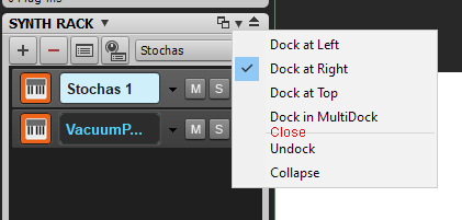
As it stands, if I open a pane for the first time it will open docked, which is as it should be. However, to make it go away entirely, I have to undock it and click on the "X" to banish it completely. I'm pressed for real estate on my 14" laptop, so I do a lot of view/pane management. It's mostly an issue with Synth Rack, which I don't open very often and don't need to have open or available all the time. My feature request is to add a "close" entry to the Docking Options button, which will close the pane entirely (whether it's docked or undocked). As follows:
-
I get how frustrating it got for people to ask over and over for these "smaller," convenience features and in turn get "big" features that it seemed like nobody was asking for. Matrix View comes to mind. Not that I haven't had fun with Matrix View, but I can imagine that if I had been waiting forever for a ripple edit indicator and a huge feature like that showed up, with no attention paid to the endless requests, I would have wanted to scream. But for 4 years now, there's been a new sheriff in town.
-
You mean nested folders? Cakewalk got that feature a couple of revs ago.
-
And yet another of the endless examples of Meldaproduction FX having crazy deep features to discover. And it's part of the FreeFX Bundle! I've only messed about with it to see how it worked. I think I only tried it in mono, but since MTuner is polyphonic, I wondered whether the polyphony is available on the MIDI out. @Milton Sica, is there a reason you're using v. 14.2 instead of the current release, v. 15.2? 15 was a pretty big update, with the addition of the "user-friendly" device UI's along with the usual optimizations and feature extensions.
-
I've seen this too, latest build.
-
Just Reclaimed 2+ GB of Disk Space on C:
Starship Krupa replied to bitflipper's topic in The Coffee House
I've posted about this in the Tutorials and Deals forums. I have a folder on my desktop with shortcuts to: C:\Program Files (x86)\Common Files\VST3 C:\Program Files\Common Files\Avid C:\Program Files(\Common Files (x86)\Avid (dawg, if an installer is sloppy enough to spew AAX, chances are it will spew it in 32-bit as well) C:\Program Files\Steinberg\VstPlugins C:\Program Files (x86)\Steinberg\VstPlugins C:\Program Files (x86)\Common Files\Digidesign\DAE\Plug-Ins (iZotope likes to spew Pro Tools RTAS) Also look for VST2 and 32-bit plug-ins that duplicate ones in your VST3 folder. NI are great for that, still clinging to VST2. I call this folder "A|A|S Wipe" because A|A|S' installer used to be the worst for spewing. I wrote them a personal email to beg that they stop, which they eventually did. I think at their worst, they put 10 useless copies of their plug-in somewhere on my C: drive. Now they're one of the cleanest. Also, don't forget C:\Users\<username>\AppData\Local\Temp. There are many leftovers in there that only a manual deletion will get rid of. Installers are fond of putting stuff there and then forgetting to delete it. -
Oh this this this. One of my favorite rants, and one that I use to troll people over 50 who say "music today is so lame compared to when we were younger." (When we were younger, "You Light Up My Life" and "Havin' My Baby" were #1 singles.) Two major reasons people develop this belief: first, we have a collective filter for crap. There was just as much crap if not more around 40 years ago, but we push those memories down because, well, who wants to remember crap? The second one, that I've never seen anyone else point out is that at some point, we stop putting as much effort into seeking out music that resonates with us. True for me, too, but I try to work against it. 35 years ago I had a job where I could listen to the radio while I worked. So 8 hours a day soaking up the local commercial alternative rock station mixed in with the local college station, and then more during my commute. Every time I drove somewhere I had the radio on, tuned to a possible source of new music I would like. Read Musician and Spin and record reviews in the local alternative weeklies. Went out to at least one show a week. Listened to recommendations from friends. I worked at finding good music for literally hours every weekday just to glean what I could that made it through the radio programmers' and record companies' filters. So, I ask my fellow over 50er sneerers of "music today": how many hours last week did you spend actively seeking out new music that you might like? Did you even do it at all? Do you ever still do it? Chances are the only time they ever get exposed to anything current is during award shows on TV, which, duh, those shows have showcased the lowest common denominator pabulum for the past 60 years. About the time that the Rat Pack-era wound down. Every once in a while, you'll get a Prince or Elliott Smith or Arcade Fire or Eminem on one of them, which people will talk about for decades because it's so unusual. Whatever style genre, whatever of popular music you like(d), there are people actively making it, and it's available for you to find via the blessed www. If you care as much about music as you say you do, then go fscking find some. Okay, this we can work with. This is easier to fix than the songwriting part. This is a matter of acquiring technical skills and applying them, just like woodworking or model aircraft building. You already have all of the physical and software tools you need. You've done the harder part, learning to play instruments and write songs. There are forums dedicated to "how do I get this sound" including this one right here. Put a link to your song(s) on them and ask the collective mind what they think of your mix and how you might improve it. For good measure, mention another song that you think does have the sound you are trying to get. You just have to be prepared for unproductive comments and criticism. There are magazines and YouTubers who regularly have people submit mixes and analyze them and give advice. Post on the Songs forum here, gives the link, and I guarantee you, everyone in this thread will go listen to it and probably give you good advice. We might even tell you that you're trippin' and that it sounds great already. About this last, seriously, at some point, we have to take in perspective outside our own. We can have inner voices telling us we'll never be as good as the people we admire, that we're just faking it. My first and foremost bit of advice for anyone: reference. If it's not sounding "pro," listen hard to a song you think is "pro" and pick out the areas where yours is missing the mark. There's software to help your stuff match pro mixes. Shoot, just buy Neutron and Ozone and turn them loose on your tracks. ? Right now, you can get two really great mastering tools, bx_masterdisk, and Shadow Hills Mastering Compressor, for free at Plugin Alliance. Mix engineering is a set of acquired tech skills. If you're not getting the results you want, acquire some more and practice practice practice. Everyone who does it has struggled with this.
-
This is a matter of perspective. Would you say the same thing to a sailing or fishing friend who was thinking of spending the same amount of money on a boat? $3500's cheap for a boat! Why would we think that a boat should pay for itself in any dividends other than enjoyment? How about a pop-up camping tent? (BTW, I agree with you that $3500 is too much, period, to spend on a computer, but someone with the handle "Mr. Torture" might be a Mac user, in which case, hey sweet deal!) On the other hand, if that friend didn't have much disposable income and had the expectation of becoming a professional charter skipper or nature guide, and had been trying to do so for 20 years without coming close to earning a living, we might suggest against it. Maybe there wasn't as much money to be made as a single boat skipper or independent nature guide as they thought. Maybe those fields are too competitive and/or controlled by larger companies who can afford insurance, advertising, etc. Maybe while it's fun to take your boat out every other weekend, it's less fun to HAVE to take it out full of people who may or may not be fun to go boating with, or face not being able to make your housing payment. It's okay for a job to be something we don't always love doing, and it's okay for a hobby not to earn us money. For some reason, that truth seems to come more easily to non-musicians. ?
-
Lot of food for thought here. The question that hasn't been addressed directly is "what do you hope to get out of making music?" We all grew up in that (relatively brief in terms of musical and human history) when (a relatively tiny percentage of) being a popular musician (and by popular, I mean following the tastes of the day) could possibly lead to international fame and riches. The "gold rush" that Kenny so wisely draws a parallel with. It used to confound me no end that the music "players" magazines placed so much emphasis on the "make it big and play in big venues" goal, as if everyone who bought a Squier Strat was supposed to have that goal and if it didn't happen, that was "failure." Someone finally came out with a magazine, I don't know if it's still around, I picked up a copy at NAMM and subscribed, called Making Music, which was dedicated to the hobby of playing and singing "just" for fun, not professionally. They had famous cover artists, but they were mostly people who were famous in other fields, successful actors, successful businesspeople, whatever. In other words it was a magazine for 99.99% of the people who buy a Squier Strat. Yet my subscription was free and I never saw it in bookstores. I mention it because at the time it was such a breath of fresh air. Since the very suppliers of tools and services depend on selling those tools and services to survive, they have (or at least believe they do) more to gain by perpetuating the myth. There's an upward path that starts with taking music lessons and ends at "pop star" and anyone who puts their foot on that path and doesn't make it all the way to the end "didn't make it." We're all older, so we have had this experience, but back when I was in a music scene, which was underground rock in San Francisco from '85-'95, nobody ever said "I play in bands as a hobby" even though everyone was doing it as a hobby, with the exception of a few, most of whom eventually gave up. It just wasn't cool to say you were doing it for fun even though in reality, there was no other reason to be doing it. All of this is to get to my point: I think it's important to be aware and honest with ourselves about what we really want and expect from playing music. And if we're feeling frustrated and unfulfilled, it's a good time to reassess that. Why did you start playing? Why do you continue to play? What would you like to "get back" from it (if anything) and what level of expectation do you have that you can get that back? People who paint, do woodworking, ride bicycles, swim, play amateur team sports, own custom cars, sail, build electronics projects, stargaze, build model railroads, whatever, as hobbies don't seem to suffer as many illusions as people who do music, or at least that's my impression. Another of my hobbies is woodworking, or at least it is a sometime hobby, it comes and goes. I have some nice power tools including a Jet contractor saw in my basement. Would I say "it's really tough to make it in woodworkingbiz" or "I've been making things out of wood for 20 years and what do I have to show for it?" Heck no. I don't have the desire to become good enough at it to the point where I could hope to do it professionally, but when my vintage home needs some trim replaced, or I need shelves or whatever, it's fun and economical to be able to do it myself. Why isn't it as okay to have music be a hobby? Or am I even correct in the perception that it is less so? Fortunately, before I started doing it, I had it figured out that I was never going to become a "rock star," but I still had goals. When I was little, bla bla, Beatles on TV bla bla. I looked at those guys and immediately wanted to do that. Not because they had all these people looking at them, but because it looked fun and cool. I wanted to get up on a stage with an instrument and make music with it and look cool. That was it. So decades later, when my first hobby band played its first real gig, and I experienced that unique sensation (I call it standing in the middle of a tornado while people pat you on the back). The big checkmark got crossed off and anything subsequent was gravy. And for the following 40 years, I've tried to keep my musical goals simple and realistic. I've gone without barely touching an instrument for years, I've switched primary instruments, learned how to write songs, etc. etc. But it's always been about seeing something and wanting to be able to do it. I did some deep diving at one point to figure out what it was about, to provide momentum for continuing, and came to the conclusion that I feel things that I can't express in other ways, and I want to express them, and connect with as many people who care to listen. Which is what listening to music is for me. Someone's expressing an emotion in their music and I listen and it makes me happy, and/or helps me know that I'm not alone in sadness or confusion or anger and/or provides me with a soundtrack for my life and inspires me to jump up and down and shake my butt. That's a beautiful process and I want to be on both ends of it. And it can be one person I'm playing to, or 100, or 1000 the more the merrier. If whatever styles I happen to be interested are no longer "in fashion," that doesn't matter any more, because there are so many outlets for people to find niche music. Being an old fart doesn't matter like it used to. I've always liked shiny toys, so owning up a collection of tools for making music has always been a big part of the fun, and I've worked at MI companies and even had my own for a while. I love my many guitars and basses and microphones and my Slingerland drum kit. They're shiny and make my heart smile. Also my Glitchmachines and Plugin Alliance and Meldaproduction and Cakewalk and Mixcraft and Ableton software and my Focusrite interface and all that. Starting with The Beatles again, I've always been interested in sound recording technology (Yellow Submarine soundtrack was the first rock record I owned, with all the crazy sounds on "Bulldog," and "Northern Song"), so now I have a home studio rig where I can create whatever sound I can manage to pick up the skills to create. For someone with my personal goals in making music, right now is the best time to be doing it in history! Geniuses keep shoveling incredible music making software onto my computer for cheap or even free! If I make something I like and want to make it available for others to listen to or purchase, I can do that without leaving my chair! I think the fact that anyone can put their music on Bandcamp is really great, so I made a song that I thought was worthy of that (and not incidentally, learned all the steps that it takes to set up the account, make a halfway decent looking cover page, etc). Check that one off. I'd like to be played on one or more of the streaming stations that plays the kind of music I like, so I went to my favorite station's site and learned how to submit songs. Check (they haven't played it yet, AFAIK). I made a video for the song because I think videos are fun. And so, thanks to the times we live in, my song is up on YouTube just like all the musicians whose work I love. Check. So, for anyone who is making music, or wants to, I would suggest that it's important at any point in the journey to know what you really want from it and as much as possible be realistic about whether those goals are achievable given the amount of drive and effort and talent you have to put toward them. And adjust them if necessary. If your goal is "earn my living with music," maybe that's going to have to include playing in cover bands and teaching. If your goal is "play for thousands of people," learn all the personal skills you can to make connections. Become emotionally resilient enough to weather inevitable setbacks. Some people did actually get some gold out of the hills, but they had to get survival skills fast. Whatever. If there were shame in not becoming a rock star, then that shame goes all the way back to Adam and Eve. And news: getting paid to do something you already love is a privilege only a tiny percentage of people ever get to experience, even once. The vast majority work at jobs they at best tolerate, but often just endure. "Deserve's" got nothin' to do with it!
-
Now we need to get one of the Cakeverse's reverse engineered add-on wizards to do a translating program. @scook or @azslow3 or @sjoens or someone like that.