


-
Posts
8,640 -
Joined
-
Last visited
-
Days Won
30
Everything posted by Starship Krupa
-
Inspired by the flat buttons in Studio One and Ableton Live, I decided to do a 2-D version of Midnight Blue that also increases the size of the transport and metronome controls (there's a lot of extra button real estate in that module). It also increases the size of the images on a few other Control Bar modules, such as Markers and Mix Recall. Mix Recall gets text on the buttons to relieve my own forgetfulness about which button does what. There's plenty of room on its buttons for text. Racing Green was originally a flat Tungsten-based theme, before I was seduced by 3-D buttons. I'm still debating whether the Record button really needs all that visual clutter telling the user what record mode they're in; my suspicion is that most people stick to one recording mode and then know from the behavior if they happen to change it. Even the stock themes' small Transport Modules omit the differentiation between record modes (although it's also debatable whether anyone actually sets their Transport Module to small). Here is a clip of the Transport Module and a couple of others: If I start using this and take a shine to it, I'll probably do a similar version of Racing Green.

-
I hereby retire from maintaining and hosting Logical, 'cause I think you've surpassed it.
-
It's right there in the error message: Cakewalk is losing contact with your audio device. That's why the suggestions to check the cable, the driver, etc. Could it stand for "Audio Capture," which may be the reported name for the Roland Duo Capture?
-
Plug-in obsolescence is an incentive to finish those damn projects and move on. ?
-

TwelveTone systems' Cakewalk Professional 3 on wine
Starship Krupa replied to MusicInstructor.net's topic in Feedback Loop
It doesn't seem that way to us old dudes due to time compression, but 4 years is a healthy bit of time in the software development world. Back in the day, that could be a product's entire life cycle. If Cakewalk were being given numeric releases, IMO it would be up to 3.0 at this point. I wouldn't want to use the first release of CbB. It didn't work too well on my system (to me, the audio engine was like a balky lawnmower that would poop out and I'd have to restart), and there are so many "smaller" features and fixes that I now take for granted because they made so much sense. I have shiny spots on Ctrl-Alt-F. CbB used to scramble up my takes if I recorded with the lanes closed (which I always do). Being able to use Aim Assist without the numerical readout obscuring the Ruler tick marks. Persistent note names in PRV. Right click and rename clip, for heaven's sake. Ripple Edit Indicator! Configurable Smart Tool! Select, right click and Process in the Staff View. The new amazing Export dialog. By themselves, maybe minor or less flashy improvements and fixes, but taken together, holy crap. Think of this: BandLab has now owned the Cakewalk brand longer than Gibson did. People who started using CbB in college are now graduating or already have. I wonder how many people can now say "I used Cakewalk by BandLab throughout college." Yet we still get people who are dubious about whether the program can "survive" as freeware. It's already "survived" better and longer under BandLab than it did under the last owners. ? No argument there. I haven't completely parsed it, but it looks like you could set up your mouse buttons to do just about anything.- 32 replies
-
- 3
-

-
- wine
- twelvetone
- (and 2 more)
-
I like the idea of offloading audio processing to the GPU, whose cores usually sit there picking their noses while running audio software. However, back when they posted the system requirements, none of my systems' GPU's met it. It's a technology, just as with UAD cards, companies can either use it or not. My concern would be that plug-ins designed to take advantage of it wouldn't run so well on systems like mine with just CPU processing. As far as the M2 announcement, I'm sure it's a heartbreaker for the Mac weenies who must have the latest thing. BTW, I don't consider ALL Mac users and fans "Mac weenies," just the ones who must have the latest or they feel inadequate. I myself have a couple of nice iMacs.
-
After decades of deferring it, I've gotten back into creating electronic music. 90% ITB, although I do sometimes sample myself playing physical instruments. I love playing out, and I recently discovered a live EDM night in my area, but I don't really know where to get started with that. It seems like most electronic music artists use a combination of backing (or sequenced) tracks with them doing some things live like triggering samples and loops from a pad controller, or playing one of the parts on a keyboard. I have Ableton Live Lite, and have putzed around with Cakewalk's Matrix, but my brain is so used to thinking of "songs" as things that are composed linearly that I'm going to have to work on thinking of it in another way. I'm no stranger to improvisation and experimental stuff, I was a fan of Terry Riley's In C and Brian Eno before I ever played rock 'n' roll and most recently played in a Rhys Chatham ensemble with 99 other guitarists. I have a good sense of where to take an improvised piece, and I can drop into that zone, but I need help with the specifics of using today's software to do it. Also doing this while keeping my songs recognizable through the improvisation. I trust Cakewalk's stability enough to use it, but I know that Ableton Live is tailor made to support live performance, and I like to use the right tool for the job. Should I invest in a pad controller? Most people I see doing this use one for at least some things, although I watched a video of Four Tet and he was using something that resembled the old Korg KAOSS Pad. People who are doing this, what has worked for you?
-
Media browser (Sample and loops Waveform Display)
Starship Krupa replied to NEO.dreams's topic in Feedback Loop
Well, for anyone who wants an integrated sampler/loop browser, I wouldn't suggest waiting for Cakewalk's to drop before using one. ? Believe that the devs know how badly we want this feature. It will take a while, both because it's non-trivial and because I'm sure they want to cover the bases feature-wise. I'm hoping for good integration with current Cakewalk features like Step Sequencer and Matrix. Like maybe the much deferred "record directly to Matrix cell" functionality. I'm in the very early stages of trying to come up with a live performance workflow for my electronic music, and would love to be able to use Matrix. I just don't know if it's "there" yet. -
TwelveTone systems' Cakewalk Professional 3 on wine
Starship Krupa replied to MusicInstructor.net's topic in Feedback Loop
I do loves me some flexible configuration ability. One of the reasons I drifted away from Mixcraft when CbB dropped was its lack of keystroke assignment ability. It's very mouse-y. I like not having to hit the keyboard if I don't want to; the advent of the context menu in Windows 95 was love at first sight. But not to a fault. I've even feature requested the addition of some keystroke commands in CbB (fit horizontal was one that was fulfilled). -
53 bit plug-ins are notorious for causing issues on bounce. The devs don't seem to care. ? Most likely culprit is plug-in incompatibility. I choose my words carefully, because I'm beginning to understand that "it's probably a plug-in" is too often read as "it's the plug-in's fault, Cakewalk is never to blame." The issue is that they're not playing nice together. I have at least one plug-in that works fine in other programs but with Cakewalk, needs to be used in VST2 form only. Otherwise it generates horrible screeching, which I do want sometimes, but not unintentionally from a chorus effect. The VST specs are loose enough that both pieces of software can be compliant and still fall down and go boom. A plug-in can expose a flaw in Cakewalk and vice-versa. Look at the Cakewalk update release notes to see the changes made to Cakewalk so it can work with certain plug-ins. As a practical matter, the thing to do is first try the operation with all FX disabled, then if it works, begin whittling down the plug-ins you're using until you find which one the operation is choking on. A VSTi may be what's not playing nice, but that happens less often. At that point, you can report to both the plug-in manufacturer and the Cakewalk devs that there seems to be a compatibility problem. The plug-in devs obviously have easy access to the freeware Cakewalk, and the Cakewalk devs can usually get an NFR license for testing purposes from plug-in developers (one of the perks of being a software developer ?).
-
TwelveTone systems' Cakewalk Professional 3 on wine
Starship Krupa replied to MusicInstructor.net's topic in Feedback Loop
I remember one poor soul who was seeking help with a precursor to Home Studio that used to come with some audio interface or other. Despite having gone through the whole process of registering with BandLab and coming to the forum, which process, IIRC, has popups pitching Cakewalk by BandLab, he was gobsmacked to learn that he could just download this whole new advanced program and use it for free. I'm not baffled by the affection for SONAR 8.5.3, and even wanting to still run it, I know that old workflows die hard, and SONAR users included many people for whom 8.5.3 was not broken, whereas X1 did not make the best first impression. I'm baffled by how people who have been using a program for that long come to this forum looking for help. And who sometimes aren't aware that what had once been the mighty SONAR is now the even mightier freeware Cakewalk by BandLab. How do you get as far as being able to post on this forum without learning that? I never ran 8.5.3, and I started up again with CbB after my last dance with Cakewalk Pro Audio/SONAR being in 2002, a 16 year hiatus. I do know that whatever version of SONAR I was running at the time was rock solid on Win 98SE, whereas the initial release of CbB on Windows 7 was....not. Noel and Jon and Morten and Ben proceeded to hammer that code until 3 months later I could leave it running overnight. In that 16 year break, I got some experience with Mixcraft and Pro Tools and FWIW, had little trouble adjusting to the UI and workflow paradigms of CbB. Despite the initial implementation, the industry was heading in the direction of take lanes, and IMO, the Skylight UI is still brilliant (and imitated, look no further than Studio One). It scaled wonderfully to the advent of multiple monitors. Once I figured out right click for marquee select?, I don't ever manually switch tools in PRV. I have the two thumb buttons on my Logi 705 configured to Ctrl and Alt, so I only go to the keyboard for Shift, in the case of constrained moves and copies. Similar with Track View regarding manual tool switching. I set the Smart Tool so that the Comp function is turned off unless I'm actually using those features and it's good to go. The current Cakewalk PRV is my favorite of the ones I've tried, which now also includes Ableton Live and Studio One. What am I missing? Is there a feature request or two that could restore what you liked about 8.5.3's PRV? -
TwelveTone systems' Cakewalk Professional 3 on wine
Starship Krupa replied to MusicInstructor.net's topic in Feedback Loop
3 more native LINUX programs with tabular MIDI event lists: https://manual.ardour.org/midi/midi-editing/midi-list-editor/ https://terryewell.com/m116/MIDI_PC_values/MIDI_PCvaluesNEW.html https://www.tracktion.com/products/waveform-pro -
TwelveTone systems' Cakewalk Professional 3 on wine
Starship Krupa replied to MusicInstructor.net's topic in Feedback Loop
This. There are multiple current products that feature editable MIDI event lists. Surely one can adapt one's workflow to one of them. A small bit of searching and checking out trial versions is more likely to yield good results than offering to buy the time of a commercial development team. With just a little bit of Google Fu, I even (in typically frugal SK fashion) found a freeware one that looks a lot like olde tyme Cakewalke: http://www.midieditor.org/ Ain't that cute? I might even just download it and putter about with it. It actually looks like the developer missed the days of the early 90's and decided to roll his own MIDI-only sequencer. Bonus: it's open source and has a Linux build, so even if it doesn't do exactly what the OP wants, that team of WINE developers (or the developer of MIDIEditor himself, he solicits suggestions) could probably add or adjust whatever features. No need for WINE. Load the .WRK files into CbB, export the MIDI, load it into MIDIEditor, et voila, workflow accommodated.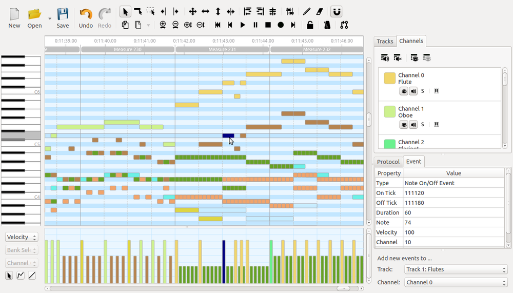
- 32 replies
-
- 2
-
-
- wine
- twelvetone
- (and 2 more)
-
Would love to see something like StepicVST within CW
Starship Krupa replied to torhan's topic in Feedback Loop
Cakewalk's own Step Sequencer already has some of these features built in. If you poke around in Cakewalk's dusty corners there are many cool things. I found out about these features by accident, searching in the Ref. Guide for information about the plug-in parameters randomizer. Notice all the things you can sequence, including to my great surprise when I found it, Step Play Probability. Yes, a built-in randomizer, with probability settings. I haven't tried it yet, but it looks like you can do any CC value you want: I posted in the Tutorials subforum about a couple of Cakewalk's randomization features: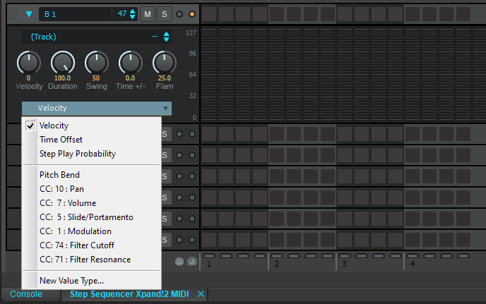
-
TwelveTone systems' Cakewalk Professional 3 on wine
Starship Krupa replied to MusicInstructor.net's topic in Feedback Loop
I really have to hand it to Dr. T for bouncing back after the 5,000 Fingers debacle.- 32 replies
-
- 2
-
-

-
- wine
- twelvetone
- (and 2 more)
-
TwelveTone systems' Cakewalk Professional 3 on wine
Starship Krupa replied to MusicInstructor.net's topic in Feedback Loop
And I suppose that in the past quarter century of MIDI sequencer evolution, every time you've tried out something newer, you deemed it inferior because you couldn't immediately work as efficiently with it as you can with Pro 3? Your old tool has finally broken. You must learn to use a newer one. Choose a current program, and allow whatever length of time it initially took you to get that good. Cakewalk still has an Event List, and my guess is that it's the feature that's changed the least in 30 years.- 32 replies
-
- 2
-
-

-
- wine
- twelvetone
- (and 2 more)
-
TwelveTone systems' Cakewalk Professional 3 on wine
Starship Krupa replied to MusicInstructor.net's topic in Feedback Loop
I've long been baffled by people coming to the Cakewalk By BandLab forum seeking help with such things as SONAR 8.3. The OP wins a prize for taking it to a new level. Have you taken a look at this:- 32 replies
-
- 5
-
-
-
- wine
- twelvetone
- (and 2 more)
-
Well, I must admit, with the more extreme presets I use with Objeq Delay, they could be masking gaps and glitches in the audio! ? Also, now that I think about it, it has such a striking sonic footprint that I've never used more than one instance of it at a time. Objeq Delay's manufacturer is still around, have you contacted A|A|S about it?
-
We need to get you sorted on this. Both of these plug-ins work fine even on my 10+ year old laptop. You can see in my sig that even my main system is not exactly a 2022 rocket sled. Have you posted your system specs? Have a look at https://devblogs.microsoft.com/windows-music-dev/unofficial-windows-10-audio-workstation-build-and-tweak-guide-part-1/ He's a Microsoft dev who's buddies with Noel, the head of BandLab's Cakewalk group.
-
Win 10 speed / power tweak questions for low latency?
Starship Krupa replied to Steve_Karl's topic in Computer Systems
Start at the very top: https://devblogs.microsoft.com/windows-music-dev/unofficial-windows-10-audio-workstation-build-and-tweak-guide-part-1/ -
I wonder if there was some equation, or analysis, or market research that told them that $29 was some kind of sweet spot, where people wouldn't think too hard about spending the money.
-
Well, yeah, so was my question. ? And he paid $600, he thinks, but estimates an new license at $35. He's really overestimating the cost of goods! The weird part is that even after bluzdog kindly clued him in, he still has the ad up.
-
Did Andy Warhol predict that in the future, all plug-ins will be priced at $29?
-
And the ad is still up! The aroma of burning herb emanates from this listing. Is this thread tiptoeing around the pirate software rules? ?
-
Probably on sale from time to time, but yeah, score. About 5 Waves plug-ins' worth. My first experience with PACE licensing, and it made me wonder what all the fuss was about! It only took half a dozen years before I had any serious hassle with it. All sorted now, though.


