
John T
-
Posts
170 -
Joined
-
Last visited
Everything posted by John T
-
I see this all the time, though I've not got any screen shots. I'll try to remember to come back to this thread next time it happens. I find that these glitches disappear and re-appear at different zoom levels, which might be a clue as to the cause.
-
Every day, I sit down to work in Sonar, and the secrecy gnaws at me, bedevils my every effort... What is Noel's shoe size? I HAVE TO KNOW. I HAVE A RIGHT TO KNOW.
-

WHERE HAVE THE COLOURED TRACK AND CONSOLE VIEWS GONE? (SOLVED)
John T replied to Waldemar Pawlik's topic in Cakewalk Sonar
Yeah, I agree, I think changes to defaults are always a bit confusing. But to be fair to the developers, it's very rare that they actually remove a feature. -
WHERE HAVE THE COLOURED TRACK AND CONSOLE VIEWS GONE? (SOLVED)
John T replied to Waldemar Pawlik's topic in Cakewalk Sonar
It's in Preferences >> Colors. I think this has existed in previous versions, but they've changed the default to "off". Which I think is confusing. But the feature is still there.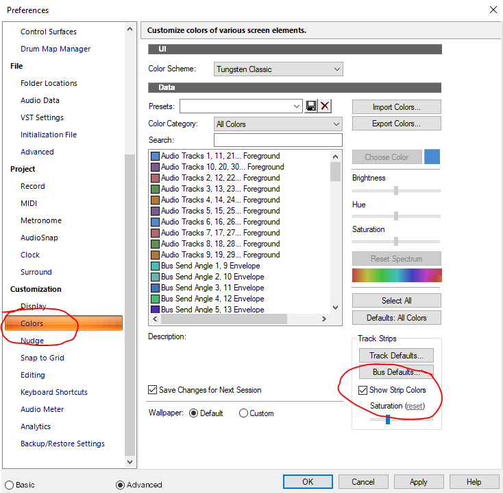
-
Did that need a warning? I mean, not knowing about it til it happens has literally no consequences.
-
I've not signed up for membership yet, but I've been regularly updating the demo and tinkering around with it. I think I get along with Tungsten Classic the best, which I find (mostly) very easy to read at a glance. I do think looking at, but not using, a user interface is a fairly limited way of assessing the merits of a user interface.
-
I suppose there's a lot of subjectivity to all this. I think Ableton has always looked superb. Plus, it has fantastic readability and internal consistency.
-
Let's face it, when the balloon finally goes up, we're going to need a bunch of half-finished jams to build a new world on.
-
That's kind of my point though. I have all the information; I'm following it all quite closely. But "Go to the top of this page and click on Other Links-Cakewalk|Home and then the Sonar tab" isn't exactly a neon sign in Times Square. My point is that Bandlab are not pushing this in terms of publicity *at all* right now. I find that odd, and off-putting.
-
As a side note to that, though: I haven't yet signed up for the Backstage Pass thing, because I agree with the general feeling that there's not enough clarity on what's happening. I mean, go to the Bandlab homepage, and tell me how many clicks it takes you to get to *any* information at all about Next and Sonar. It's like they don't exist. I'm kind of going to need the company to show a bit more enthusiastic support for their product before I put any cash down. https://www.bandlab.com/
-
I'll say it! It's miles easier for me to pay small monthly amount than a single price up front. Obviously, the specific terms may or may not be favourable, but I have no fundamental objections at all.
-
That's kind of what I mean, though. Existing subscribers don't generate any new money.
-
Well, that's the thing. There's been no active promotional push on it anywhere. The most it's talked about is here, by a long shot, and it's not even talked about that much here. The uptake so far has to be pretty low.
-
There's no denying that this is the oddest product launch I think I've ever seen.
-
Yeah, for sure. I think it's also worthwhile to make suggestions and talk about any difficulties. But I think it's clear that they're seriously engaged in trying to make it as good as possible. I do have a lot of faith and trust in them, and they have earned that over many years.
-
That picture illustrates my above point a bit I think. Don't you think the ProChannel stuff seems less finished than the rest of it? Really basic designs for EQ and Tube, no redesign at all for Console Emulation, etc. I also don't love the way the ProChannel view buttons are underlined rather than highlighted. I think overall readability of the PC is a bit lower than the rest of the UI.
-
I've been meaning to make a post comparing the old and new EQ modules myself, though I think I'll do it in a separate thread to make my point as clearly as possible. Short version for now though: I don't think the PC modules are typical of the new UI. I think the new UI looks great in nearly all of the main views. I do think, though, that the redesigns of the PC modules are a bit perfunctory. And most importantly, lose some clarity of function. In the images above, notice how the old version clearly connects the slope dials to then high and low pass. That's certainly not obvious to a new user in the new version. Also note how the bell / shelf switches don't even look like switches, unlike much better designed switches elsewhere in the UI. I'll go into more detail sometime when less busy, but it'd be great to see the PC modules brought up to the same level of polish. And I do mean more in terms of functional clarity more than aesthetics. Though I think functional clarity does tend to be more attractive by default.
-
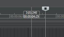
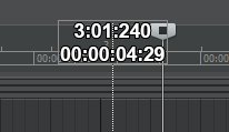
One of the things I do a LOT is very precise editing of stuff in the timeline for largely non-music work (audiobook editing, sound effects placement, etc.) And what would improve my daily life almost immeasurably, would simply be if this: ... looked more like this Which is to say; numbers in the time ruler stay generally as they are, but the number at the top of the Aim Assist line is magnified.
-
Was about to say what SteveC said. And to reiterate his first point, the initial CTRL+Click+Drag will create a new clip gain line on any clip that didn't already have one. So you can create and start editing in a single move. It's super efficient once you get in the habit of it.
-
New Sonar - odd issue with export file sizes...
John T replied to Greg Wynn's topic in Cakewalk by BandLab
Is anything different in the cut off part of the second picture? In particular sample rate? -
[solved] Display scaling slider in new Sonar update
John T replied to John T's topic in Cakewalk by BandLab
Yeah, I really like this feature. Needs a bit of refinement; I've managed to make it do some weird stuff. But when it works right, it's great. -
[solved] Display scaling slider in new Sonar update
John T replied to John T's topic in Cakewalk by BandLab
Yeah, that was it. -
[solved] Display scaling slider in new Sonar update
John T replied to John T's topic in Cakewalk by BandLab
Huh, how odd. I definitely got a notification and installed. But just found another update via the help menu, so that must be it. -
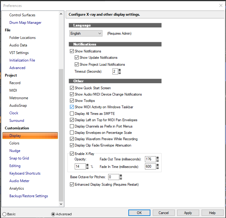
I've just downloaded the latest version: ... and the release notes say Custom Display Scale Slider (Experimental) The Display tab of the Preferences now features a slider to adjust the display scaling of the app independently from the global Windows display setting. Note that this feature is still in early development and there may be issues when applying a custom app value. However, I'm still not seeing that in preferences:
-
When I see some of the stuff people get dramatic about on the internet, I can barely imagine how they deal with an actual problem.