


John T
-
Posts
180 -
Joined
-
Last visited
Posts posted by John T
-
-
Yeah, pretty essential feature this for how I work.
-
It might be time to get over the discontinuation of Project five two decades ago.
-
I'd like to distance myself from any themes of "cakewalk are lying cowards" and "kids don't make real music any more" emerging in this thread. I don't believe either of those things.
-
 2
2
-
-
The thing that puts me off the subscription is that I use a DAW to make a living, every day. And given how erratic what I make a living at is, cash flow problems do happen. So if my main work software is going to lock up and stop me working abruptly because of a missed payment, that's not good. May seem a fringe case, and it is, but these things do happen.
-
1
-
-
It's been in for years. My screen captures in this thread are from CbB.
-
1
-
 1
1
-
-
I find save time is mostly dependent on the number of edits in audio tracks. Extremely dense MIDI data can also contribute. The actual length of the project time wise doesn't really matter.
Say for example you had 8 tracks of unedited audio, of let's say a two hour concert. The project file for that is tiny, just eight track numbers / names and start times, more or less. And the save time will be really quick.
Where on my audiobook work, I can often have a single track of audio with hundreds of tiny edits over a half hour chapter, and that will save significantly slower.
-
17 hours ago, Matthew Simon Fletcher said:
I get this may seem like a minor issue but when you're dealing with a lot of tracks at a high level, it's really key to be able to know where audio is/isn't, so you can quickly trim sections that aren't needed but without moving other content. Currently due to this it's taken me longer to tidy-up / check a project and conversely I've also accidentally deleted things, thinking they were simply a UI glitch due to this bug.
I agree with this.
Also, one of my use cases is audiobook and podcast editing, and it's a tangible slow down having to check for phantom marks like this.
-
1
-
-
I'm not sure about that. There isn't a click there, so there shouldn't be a detail to highlight, really. Though next time it happens, I'll see what turning the outline on and off does.
-
1
-
-
Got a video clip here. Observe the spike appearing and disappearing as I zoom in and out. Though there's not much consistency as to what levels it appears and disappears at.
-
1
-
-
I see this all the time, though I've not got any screen shots. I'll try to remember to come back to this thread next time it happens.
I find that these glitches disappear and re-appear at different zoom levels, which might be a clue as to the cause.
-
1
-
-
Every day, I sit down to work in Sonar, and the secrecy gnaws at me, bedevils my every effort... What is Noel's shoe size? I HAVE TO KNOW. I HAVE A RIGHT TO KNOW.
-
2
-
 4
4
-
-
Yeah, I agree, I think changes to defaults are always a bit confusing. But to be fair to the developers, it's very rare that they actually remove a feature.
-
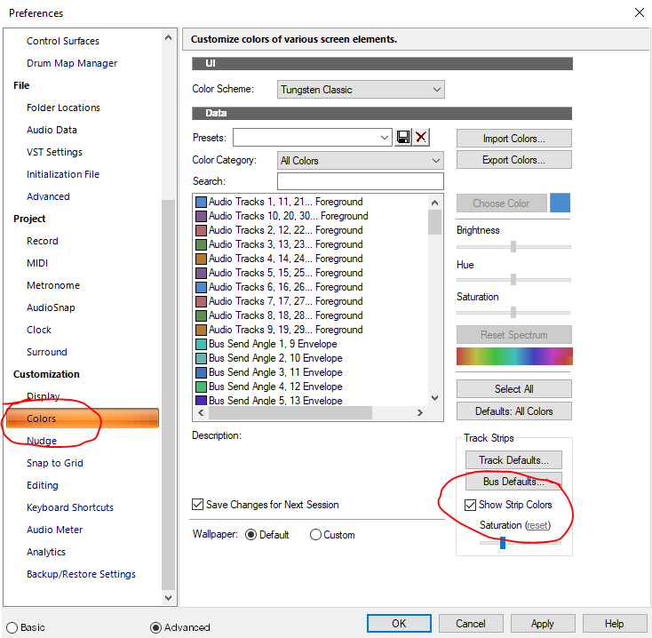
It's in Preferences >> Colors.
I think this has existed in previous versions, but they've changed the default to "off". Which I think is confusing. But the feature is still there.
-
2
-
2
-
-
5 hours ago, CSistine said:
Like we got plenty of warning when they changed the re-authorization period to 30 days?
Did that need a warning? I mean, not knowing about it til it happens has literally no consequences.
-
 1
1
-
-
I've not signed up for membership yet, but I've been regularly updating the demo and tinkering around with it. I think I get along with Tungsten Classic the best, which I find (mostly) very easy to read at a glance.
I do think looking at, but not using, a user interface is a fairly limited way of assessing the merits of a user interface.
-
I suppose there's a lot of subjectivity to all this. I think Ableton has always looked superb. Plus, it has fantastic readability and internal consistency.
-
23 minutes ago, pwal³ said:
are these in your bunker with the canned beans and water bottles?
Let's face it, when the balloon finally goes up, we're going to need a bunch of half-finished jams to build a new world on.
-
11 minutes ago, Lynn Wilson said:
Go to the top of this page and click on Other Links-Cakewalk|Home and then the Sonar tab. At the bottom of that page is the link to download. You can tell that Sonar is now active and available. It may not have all the answers you're looking for, but it has more information than you've provided
")
That's kind of my point though. I have all the information; I'm following it all quite closely. But "Go to the top of this page and click on Other Links-Cakewalk|Home and then the Sonar tab" isn't exactly a neon sign in Times Square.
My point is that Bandlab are not pushing this in terms of publicity *at all* right now. I find that odd, and off-putting.
-
1
-
-
As a side note to that, though: I haven't yet signed up for the Backstage Pass thing, because I agree with the general feeling that there's not enough clarity on what's happening.
I mean, go to the Bandlab homepage, and tell me how many clicks it takes you to get to *any* information at all about Next and Sonar. It's like they don't exist.
I'm kind of going to need the company to show a bit more enthusiastic support for their product before I put any cash down.
https://www.bandlab.com/-
3
-
-
I'll say it! It's miles easier for me to pay small monthly amount than a single price up front. Obviously, the specific terms may or may not be favourable, but I have no fundamental objections at all.
-
That's kind of what I mean, though. Existing subscribers don't generate any new money.
-
1
-
-
Well, that's the thing. There's been no active promotional push on it anywhere. The most it's talked about is here, by a long shot, and it's not even talked about that much here. The uptake so far has to be pretty low.
-
There's no denying that this is the oddest product launch I think I've ever seen.
-
4
-
 1
1
-
-
6 hours ago, veetek said:
I think we just need to be patient and let the developers work on it.
Yeah, for sure. I think it's also worthwhile to make suggestions and talk about any difficulties. But I think it's clear that they're seriously engaged in trying to make it as good as possible. I do have a lot of faith and trust in them, and they have earned that over many years.
-
1
-
Export always has a tiny gap at the start
in Cakewalk by BandLab
Posted
Using last version of CbB.
Am just doing some experiments with masters for an album where one track flows seamlessly into the next. I have a solution for the time being, and will assemble it in HOFA instead of Cakewalk, but I have discovered something odd.
Seemingly no matter what I do, I end up with 0.033 seconds of silence added to the start of the file.
Am exporting by selecting only a clip in Cakewalk, and the audio data in that clip starts right away.
Anyone ever come across this?