Adam Compeau
-
Posts
118 -
Joined
-
Last visited
Everything posted by Adam Compeau
-
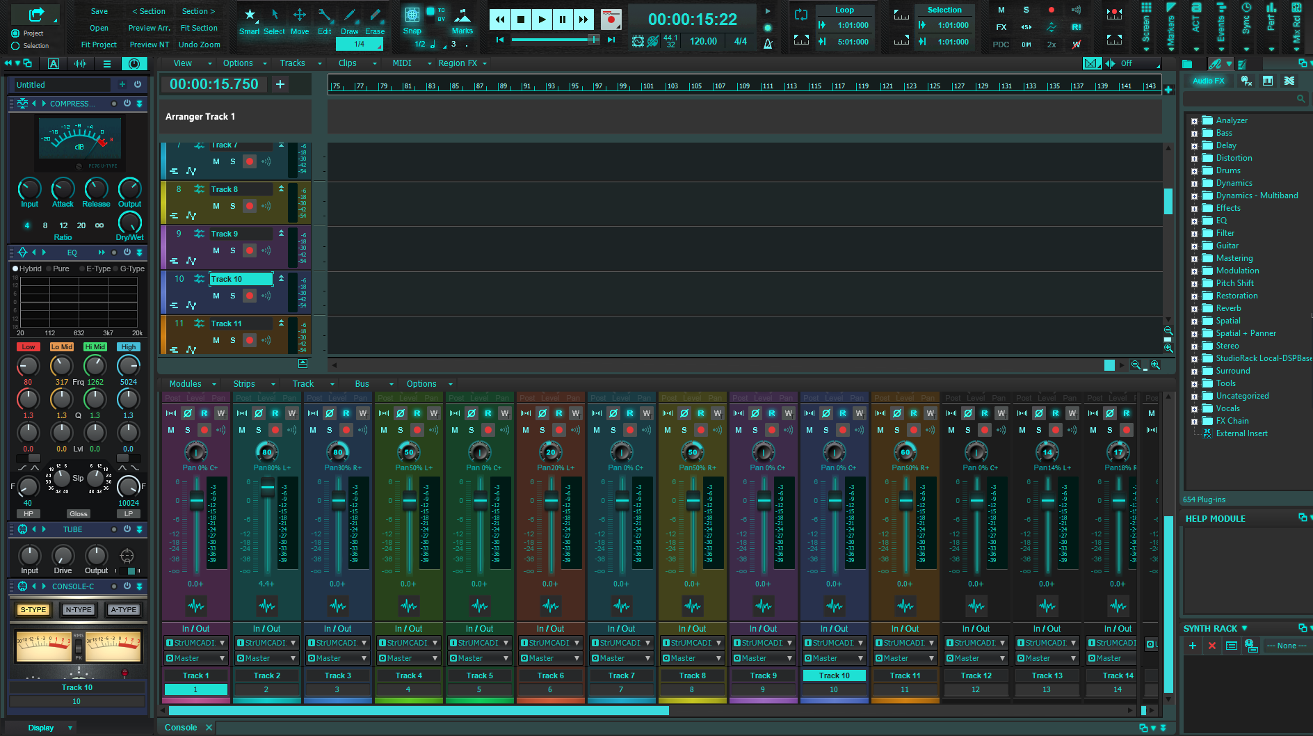
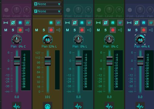
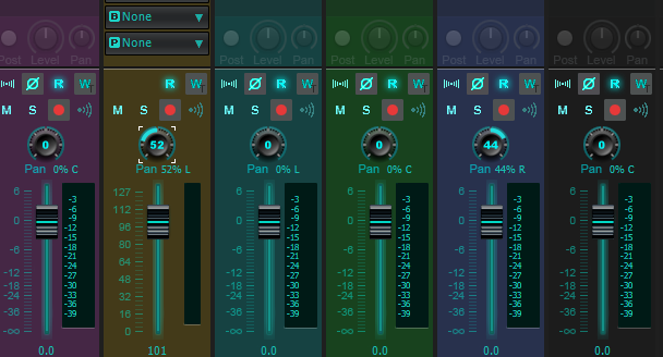
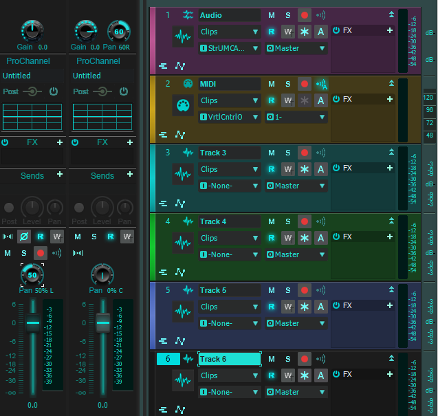
5.22 Black EQ and Tube knobs more contrast. 5 Pan options marked clearly to download. http://www.mediafire.com/folder/yl5dr3tcce30x/AC_DA_-_5_Pan_Options It's super easy to download and then change versions on the fly, so I chose to keep making separate themes for the Pan variations for now. Darkening all knobs the other day had a negative affect on the Black knobs that I chose to put no perimeter markers around...I like the variety, but had to lighten them.
-
.5 with the C added to the download folder... http://www.mediafire.com/folder/yl5dr3tcce30x/Cakewalk
-
C for your name ..
-
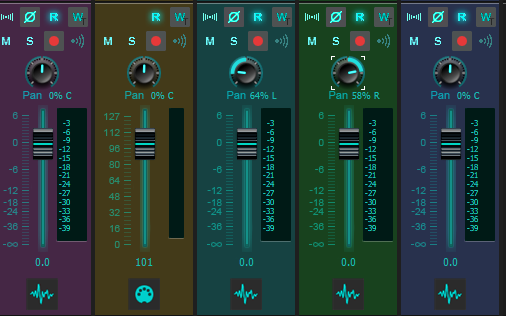
I agree, partly because I have experimented with this for a while...However, I often do things for a reason of my eye sight and habits and don't mind making an option. And then, I get obsessed...So, here are 4 Options! LWOL! .1 Pointer line with Numbers - .2 "0" with Numbers - .3 No Numbers - .4 Faint line with numbers (my preference) I also corrected (darkened) shadows of all other knobs to match the darkness of the Pan. http://www.mediafire.com/folder/yl5dr3tcce30x/Cakewalk ...all 4 should be in that folder...
-
.
-
And then, the famous, no no numbers! I honestly can make all of these available as 5.2.1, 5.2.2, 5.2.3, etc...not difficult...
-
C for Center! Yet another option... ?
-
Personally, I may use the 0 for me. I can make the single pointer line with numbers for you and others, or even just make it with no numbers and just the pointer all the way around like the gain. ..numbers do no fit in there with the pointer. What do you think, or do you want all 3? ? Ps. I might actually personally still stay with the subtle line...I like the pan to look asleep until I use it..Anyway, thankfully, things are flexible..
-
Just in case you are wondering. I cheat and use knobman software...only from japan I think and it is a java program currently.
-
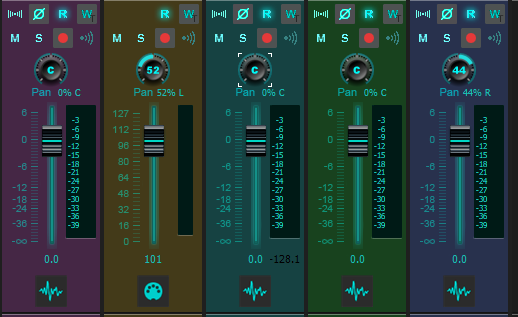
Hey, I found a way just to copy and paste only the center gain knob part without rebuilding the pan knob entirely! So, how does that look? Most people might like that better...I try to be creative and logical all at the same time! Lol
-
Because of the numbers in the middle, the best compromise I can find is using 0, which is super logical anyway...The pointer interferes with the numbers. I tried an I and it just looked like a 1. Of course, I could paint line at center I suppose, but.... Of course, with no numbers, it could be a closer match to the gain, but I the big numbers are very helpful to my eyes! ?️ Do you like this look?
-
I think I might have misunderstood you suggestion anyway...funny how we can read into things... Maybe you just wanted it thicker (like you said)...In re-reading, I don't think you are wanting a different knob, just a better matching center line? Lol I made the current pan center line with just the | from the keyboard... and I am working on some other options here...hmmm? I think the letter I is going to look thicker...
-
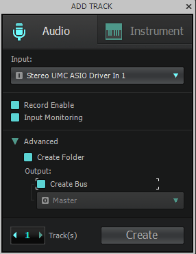
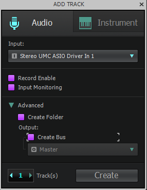
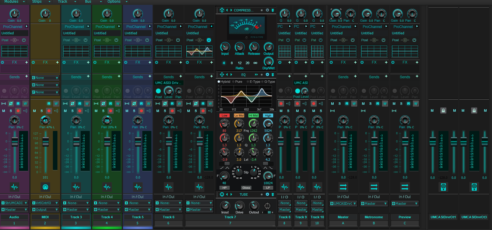
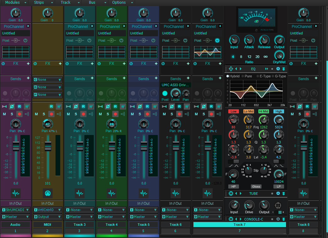
I can make that available. As a matter of fact, I might make a few different Pan knobs available for people. Personally... EDIT: The follwing is wordy and not exactly to the point! Lol I like Pan to be somewhat different than other knobs because the middle is an idle position unlike other knobs. I consider leaving it totally blank at center (then it is kind of hard to see), with a 0 and center which sometimes looks OK and of course I've used the pointer. With numbers and the outer glow, the pointer gives a 3rd indicator which can be fine, but I try to avoid. ? Also, with the Cakewalk Inspector open, sometimes you have a Pan and a Gain next to one another and I like to quickly be able to tell the difference.
-
5.21 With NEW Knobs and Faders. http://www.mediafire.com/file/2qjnox1ffzazp8u/AC_DarkAqua_5.21.sth/file 5.21 adds a little more color to the Faders..

-
I'll try to get a version with the knobs uploaded soon. Thanks!
-
I'm pretty happy with these knobs for my purposes. I need to update the Fader buttons to match..DONE
-
http://www.mediafire.com/file/kcppoe92u40gbb1/AC_DarkAqua_5.12.sth/file 5.12 Sonar "Toast" Logo replaced with Cakewalk. I/O text was too bright.
-
http://www.mediafire.com/file/n42rtq8kz1et0e3/AC_DarkAqua_5.1.sth/file 5.1 More Knobs ...Cool Faders hopefully next...
-
http://www.mediafire.com/file/8zknmx7ol8o41k4/AC_DarkAqua_5.0.sth/file 5.0! So Very Many More Corrections and Clean ups!!! Even the Pro Channel Preset Buttons were broken... Colored many more things...there are a few minor things still left for the future. NEW Pan Knobs of my liking - I will probably update the fader knobs soon too and another thing or two. ...again Starship Krupa pointed out a few things to correct as well...

-
Starship Krupa is keeping me on my toes! There was still room for improvement with Contrast. http://www.mediafire.com/file/oxsuogbujs8vwbw/AC_DarkAqua_4.80.sth/file Download 4.8 I updated the entire tool module (Darker de-selected items and brighter but non-glow selected items) - Easier to see the selection. Snap button - Darker de-selected and less green selected.. Loop Button - Darker/Brighter also... Metronome Select Buttons - A little brighter selected...I already had the de-selected darker prior...
-
OK... Starship Krupa corrected the Collapsed Browser Icon Color and Steve C guided me to change the color of the Performance meters. I added dimming the bright active Disk Lamp as it was too bright in the performance module. I also smoothed out the Matrix Circles a bit... Here is Version 4.77 http://www.mediafire.com/file/honkrzqfx0zqhwz/AC_DarkAqua_4.77.sth/file
-
Thanks. Exactly..I hadn't decided what color yet, probably just light aqua.. ?
-
I've used GIMP for quite a while and now for Cakewalk I decided to give Paint,net a try since they recommended it... A few things are different like Fuzzy select is now Magic wand and quite a few other differences. But, it seems to be speeding things up for me a bit... Magic Wand with Hue / Saturation has made several changes really fast! Many items I have to paint, but when I can get the Hue / Saturation to work, it is awesome!
-
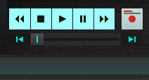
OK...my poor family! I thought the transport Record button would be to hard to change, (it has several different forms) but it gave me not much trouble. That gray was killing me!!! now it is aqua-ish when idle and red when pressed... http://www.mediafire.com/file/4xk17mex1qc4tb0/AC_DarkAqua_4.75.sth/file 4.75
-
Someone had put purple select buttons in there and I decided to make them aqua after all even though they were interesting... http://www.mediafire.com/file/m5yyi55swoc6mx9/AC_DarkAqua_4.71.sth/file 4.71