Canopus
-
Posts
1,164 -
Joined
-
Last visited
-
Days Won
7
2 Followers
-
Orders of magnitude advances in GPU power since then, on all types of devices, might be the very reason why Apple makes these changes. I guess we'll just have to wait and see.
-
Considering that Microsoft always follows Apple design-wise, the recent presentation of Apple’s Liquid Glass, coming to all their platforms this autumn, will most likely mean that Microsoft soon will make similar changes to Windows. This leads me to believe that there is a GUI paradigm shift ahead, and that the current simplistic, flat look of so many DAWs and plugins will have to adapt, or otherwise soon look very dated. Let’s hope that the architecture of Sonar’s vector-based design is flexible enough to meet the new modern.
-
 It's still there. Just scroll down a few pages in this post and you'll see it.
 -
[CONFIRMED] No Synth Rack Option In "Views" For Icon Size?
Canopus replied to sjoens's topic in Feedback Loop
No. In both CbB and Sonar, the only way to do it is in the Synth Rack drop-down menu. -
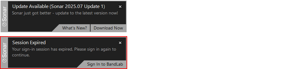
I just updated Cakewalk Product Center to the most recent version. When doing so, I had to sign in to BandLab, which I did. But only five minutes later, when starting Sonar, I get a 'Session Expired' toaster. Is the BandLab backend server slowly developing dementia? If the server can't remember my log-on status for five minutes, it sounds pretty alarming. At the same time, I did get a toaster stating there was a Sonar update available. Could it be that you are automatically thrown out whenever there’s an update? If so, is that really necessary? To me, this 'Session Expired' toaster usually occurs several times each day, so it's becoming a nuisance. Persistence is futile?
-
Where is the Sonar Free Tier download? Do I need a Bandlab membership?
Canopus replied to tecknot's topic in Cakewalk Sonar
Now that would really be something! No, you should be able to just download the most recent version of Sonar. Sonar Premium and Sonar Free Tier is the exact same product. Whether it will block certain features, or not, simply depends on the user account you're logged in to. If a user hasn’t got a paid membership, those features will be blocked. If you can’t find a download link anywhere else, you will find one at the bottom of this page: https://www.cakewalk.com/sonar?default.asp -
I have no idea. If it's not a support issue, then maybe there's no place to go.
-
This is basically a peer-to-peer forum. One can never expect developers and/or support staff attending to every question raised. In fact, sometimes they do, by their own free will, but that's the exception and not the rule.
-
Okay, so it seems to be a Color Scheme thing. When using a scheme with brightly colored control backgrounds, like Light or Light Gray, everything looks okay. Using a color scheme with dark control background, the controls are colored in such a way that it's not visible. However, they are selected. Sounds like a pretty easy fix.
-
That chart needs to be updated. Workspaces has a Crown symbol next to it in the last version of the Free Tier, and so has the Run Tasks button in the Export dialog. Additionally, Offline Help is not mentioned in the chart, but is currently blocked in the Free Tier. However, BandLab marketing seems to have changed their minds about that one.

-
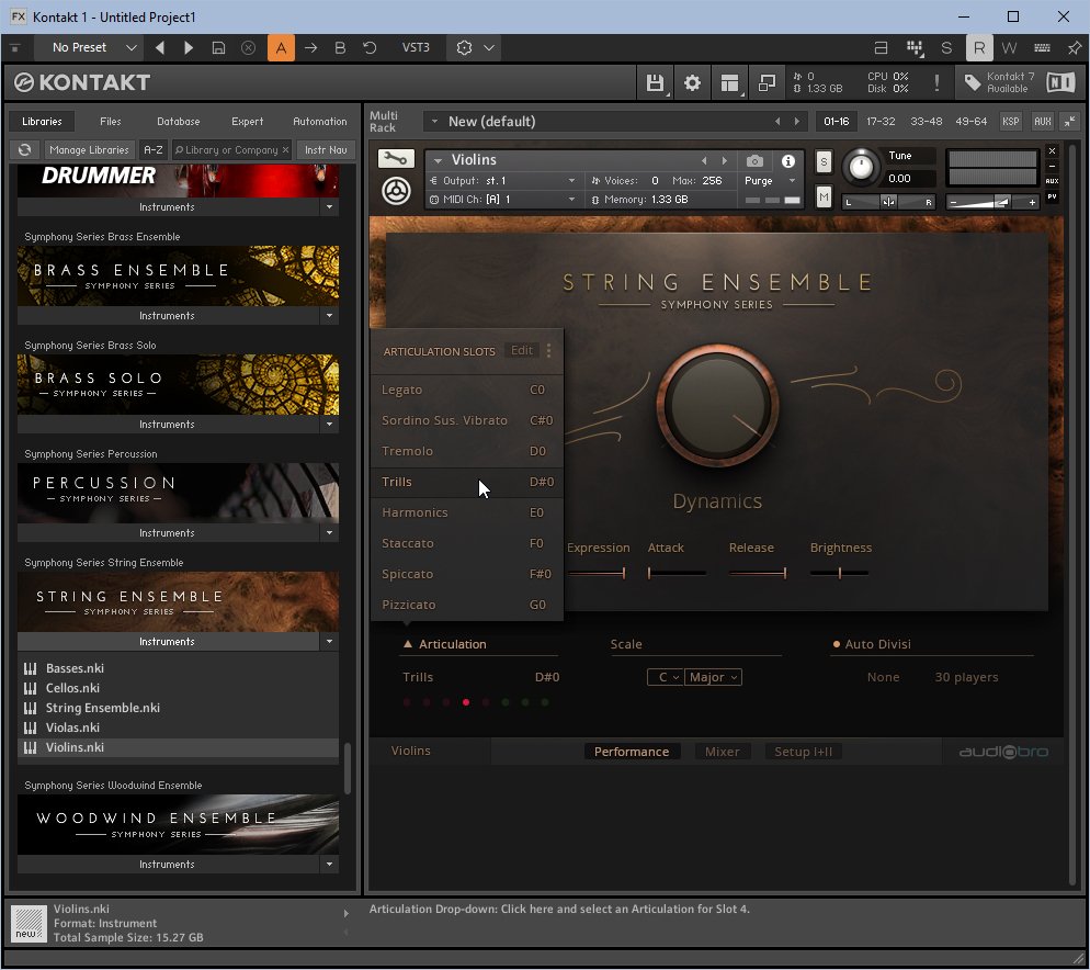
As I don’t know your background, I may say things you already know very well. If so, bear with me. You don’t mention what plugin you’re using, but I must assume that it’s a string library with a number of articulations. If it’s only got legato, then I don’t think it’s possible to get realistically sounding trills out of it. Simply put, look for a plugin library with a Trills articulation. Here’s one example from Native Instruments: As for human feel, any orchestral library, worthy of its name, would use round-robins. Basically, they record a number of samples that contain the same note, but as it’s recordings of human performers, each sound will differ slightly. The plugin will then switch between different versions of that sound, so that it feels more human.

-
Where is the THEMES folder located in the old Sonar X3 Studio?
Canopus replied to tdehan's topic in Cakewalk Sonar
I don't think SONAR X3 ever had support for themes. It first appeared with SONAR Platinum. -
I think that’s exactly how it’s supposed to work, as one of the staff once told me so. But given all the people above who doesn’t have got it to work, as well as my own experience, I suspect there’s some glitch in the code. Maybe if that push notification isn’t immediately attended to, and the supplied download link isn’t clicked while still visible, Sonar won’t give you a second chance to download? I have no idea, but I definitely think someone should look into it.
-
As none of the proposed solutions above have managed to solve the problem, I'd suggest both of you contact Cakewalk support.
-
Check if you’ve got a file called SonarHelp_Documentation_1.0.0.21.exe in your Downloads or possibly Downloads\Cakewalk, folder. If so, just double-click it. That’s how I solved the problem on my computer. The file had been downloaded, but never installed, and that's why it never turned up among the product update links.