


Steven White
-
Posts
22 -
Joined
-
Last visited
Everything posted by Steven White
-
Thanks for the advice. I had to sign out and sign back in again in the Product Center, now the content is there.
-
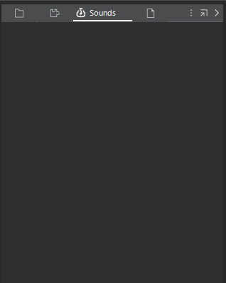
I have the subscription Sonar. and I am signed in to Bandlab. This is what my browser looks like when I select the "Browse Bandlab Sounds" tab:
-
In the Browser View, there is a tab with the Bandlab icon and the word 'sounds'. When I hover it displays "Browse Bandlab Sounds". When I click this tab, the display is empty. How do I populate this display?
-
When I update, it opens a browser tab that starts: For more details about the latest changes, click here. New in build 31.07.0.084 But the link takes me to a page that says: "We could not find that topic."
-
Hi, I see a new tab "Browse Bandlab Sounds" in the browser panel, but there is no content, it is just a blank. Is this the new Bandlab sounds integration? How do I populate it?

-
Font size and contrast improvements needed
Steven White replied to Steven White's topic in Feedback Loop
Here is another example. I am looking to expand the EQ from the ProStrip, see if you can make out the icon.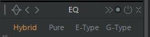
-
Font size and contrast improvements needed
Steven White replied to Steven White's topic in Feedback Loop
I see they are updating the light gray theme, but I still use Tungsten because it has contrast where I need it. I wish they would make a way to increase font size and contrast, much of the text is still illegible. There is lots of blank space and really never any good excuse for text and background that are almost the same shade of gray.

-
Input driver list friendly names for each channel
Steven White replied to Steven White's topic in Feedback Loop
Thanks, problem solved! -
My interface has 8 inputs. Sonar lists them as 4 stereo pairs, with the option for "friendly names". I would like to give each input its own friendly name. For example, in preferences I have a checkbox for "1+2 UMC ASIO Driver In 1" and in each track in my project I can select either "UMC ASIO Driver In 1 L" or "UMC ASIO Driver In 1 R" or "UMC ASIO Driver In 1 S". So I have to remember which mic I have into the left and right channel, which kind of defeats the whole purpose of "friendly names". It would be nice to be able to give each channel its own name in driver preferences.
-
The inexplicable wretchedness of trying to use the drum pane
Steven White replied to Starship Krupa's topic in Feedback Loop
Mike to the rescue! https://youtu.be/sIquUl-7NfE?si=HbsPfsAUl22zmv16 -
Font size and contrast improvements needed
Steven White replied to Steven White's topic in Cakewalk Sonar
Thanks, found it -
Font size and contrast improvements needed
Steven White replied to Steven White's topic in Cakewalk Sonar
Thanks, found it -
Please make the small fonts bigger, and make the color of text always contrast with the background. One of the reasons I went for the new Sonar was that I heard there were improvements to the blurriness. While things are a little sharper, some of the fonts are still too small and some lack contrast to the background color. Increasing the display scale makes the small fonts a little bigger, but also everything else gets bigger too, including things that were already large. The size of the modules and strips becomes unwieldy. There are a variety of text and background colors, and sometimes the text and background are almost the same.
-
Font size and contrast improvements needed
Steven White replied to Steven White's topic in Cakewalk Sonar
I'm sorry, I can't find the feature request forum. -
Font size and contrast improvements needed
Steven White replied to Steven White's topic in Cakewalk Sonar
I didn't really like the theme editor too much. A lot of the elements were images, not editable. this is what i thought would get fixed with Sonar BBL. -
Font size and contrast improvements needed
Steven White replied to Steven White's topic in Cakewalk Sonar
I have tried with DPI awareness on and off, on is def better but doesn't compensate for very small font and low contrast of some text elements. -
Font size and contrast improvements needed
Steven White replied to Steven White's topic in Cakewalk Sonar
Many of the elements are more legible in the light theme, but not light grey or other light themes, but there are some controls that are in a light color font that become hard to see, and some font sizes that remain very small even with display scale at maximum. The problem with display scale seems to be that it increases the size of the large things even more than the small things (I guess that is what 'scale' means) when what is needed is just an increase for the few but important items that are just way too small, markers for example. -
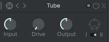
One of the reasons I went for the new Sonar was that I heard there were improvements to the blurriness. While things are a little sharper, the fonts are still too small in many places, and often are low contrast to the background color. I have tried the different themes, they all have this issue. The fonts do get a little bigger when you increase the display scale, but the size of the modules and strips becomes too unwieldy. I don't need bigger strips, What I need is larger font and more contrast. For example, in the tube module the font is almost the same gray as the background, and in the sequencer strip the letters for mute and solo are large enough but the names of the instrument are too small - it's the same strip, so there is definitely room for a larger font. I hope these improvements can be made, I don't think I will renew if I have to keep squinting to use the program.

-
How do I set the time ruler so that 1 is where the actual beats start?
Steven White replied to GTsongwriter's question in Q&A
I think the question is about the time ruler DISPLAY, not necessarily any MIDI values. It just needs to SHOW a different value in the track view, not change any of the musical information. At least for me, that is what I am looking for, just to be able to make sense of the song, for instance if I working with a 12 bar blues, than it's easy to find the top at measures 13, 25, etc. instead of having to add in my head however many measures are before the song starts. -
My project somehow has an extra 'Now Time Marker' that is visible, but does nothing and can't be moved. A 'ghost' marker, you could say. How to get rid of it?

-
Old VST2 plugin causes Cakewalk by Bandlab not to close down entirely.
Steven White replied to Geert Jonkheer's question in Q&A
Hi, I got Cakewalk to close after using Emulator X3 as a VST by freezing it before I close Cakewalk. -
Message " Cannot Find or open File"
Steven White replied to Александр Кулаев's topic in Cakewalk by BandLab
I'm having the same problem.

