Sergei Pilin
-
Posts
56 -
Joined
-
Last visited
-
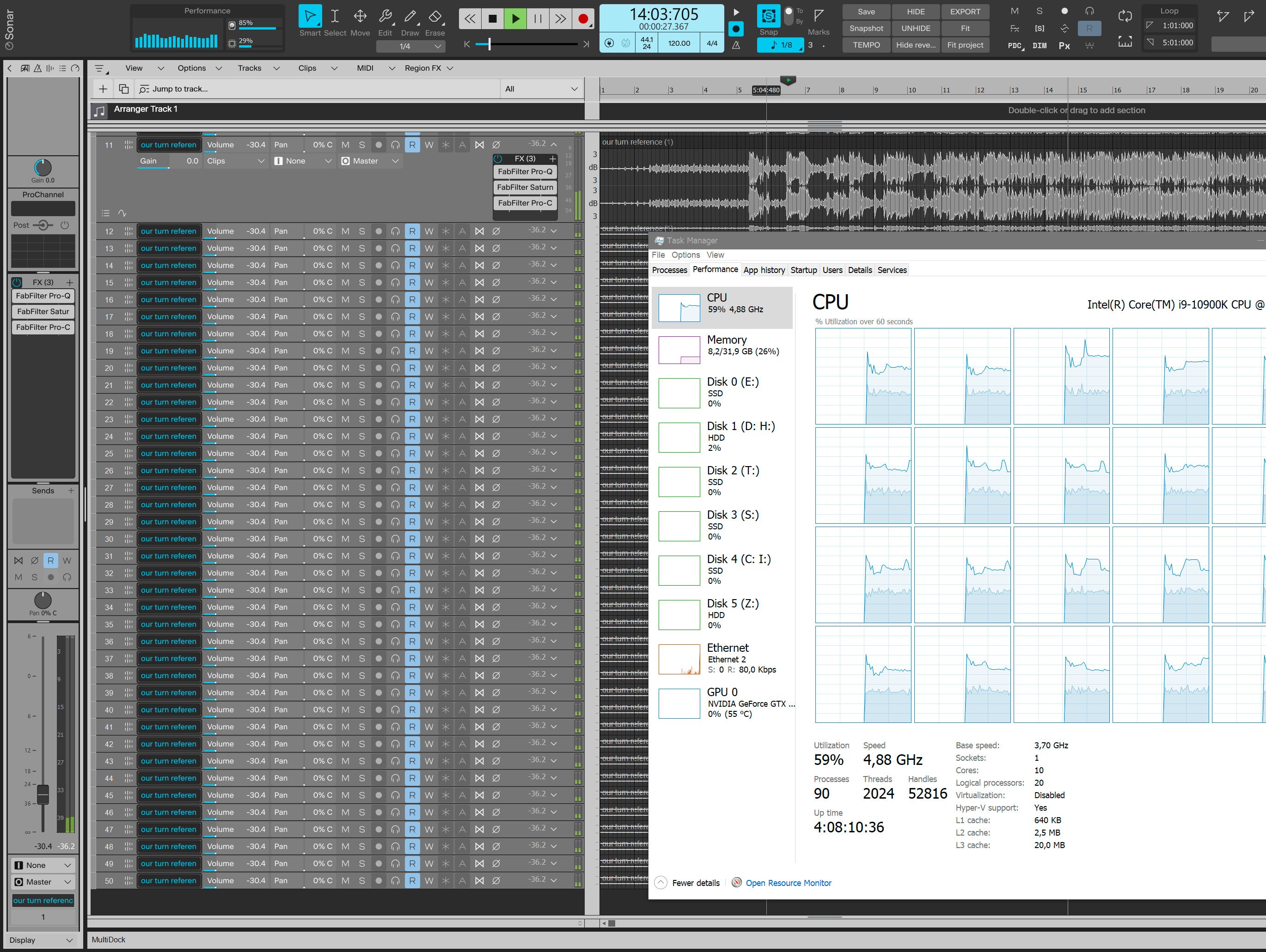
 Right? One would think that this nice core balancing would benefit as far as overall CPU usage goes, but no, for some reason it makes things worse. Here's this exact project attached, would love to know how it compares on different setups. FF Q3, C2, and Saturn needed, the missing audio file can be replaced with any other stereo one. Maybe there is something abnormal with the both my computers after all. test 50 tracks.cwp
 -
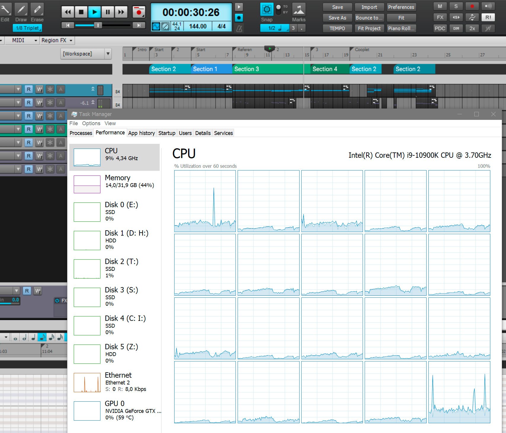
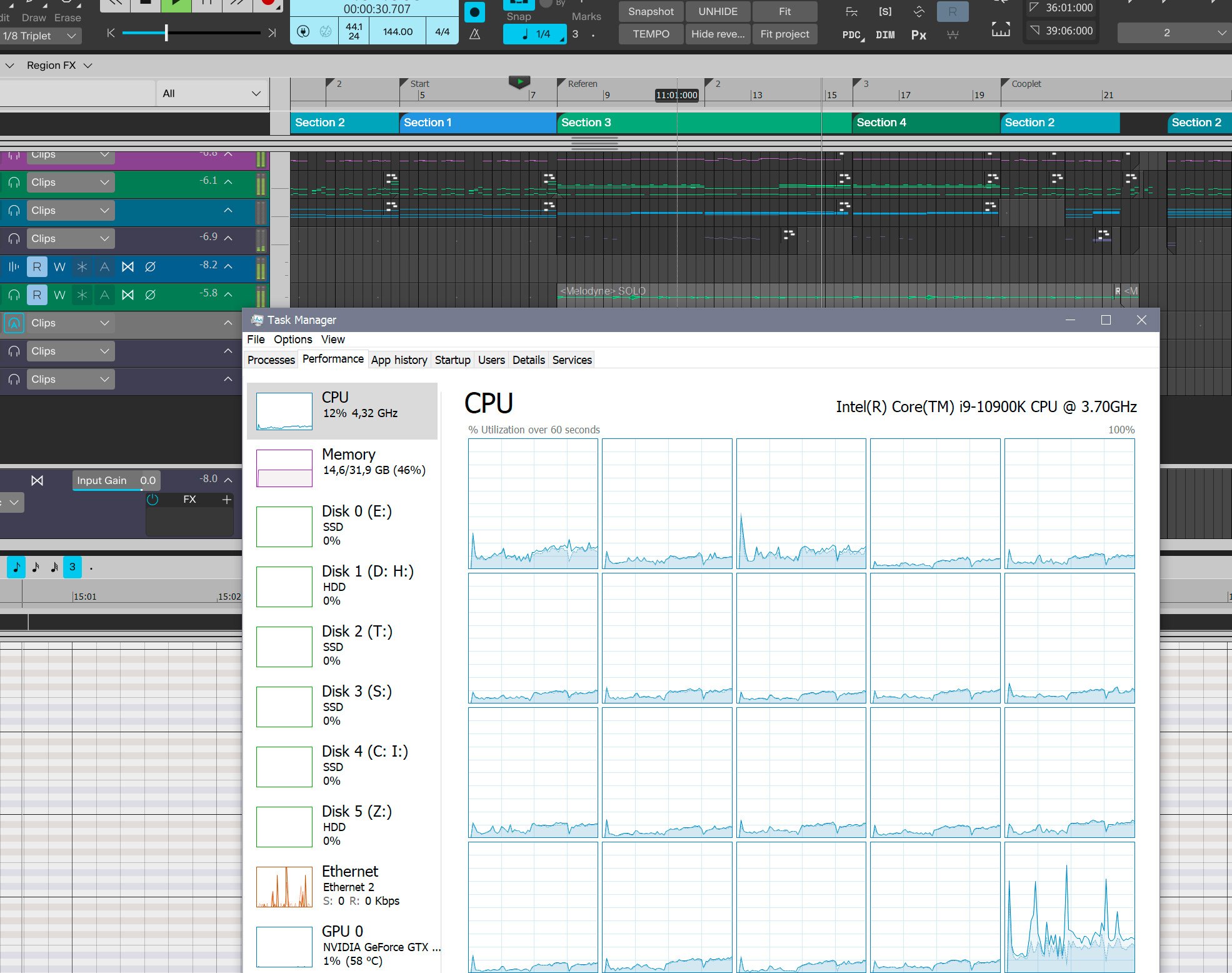
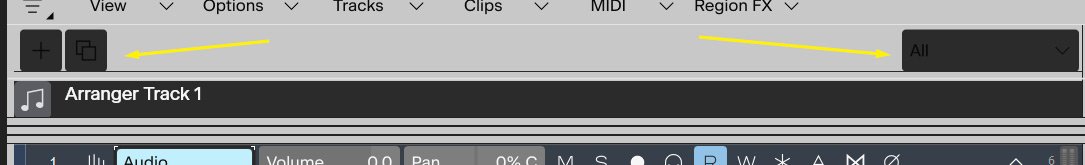
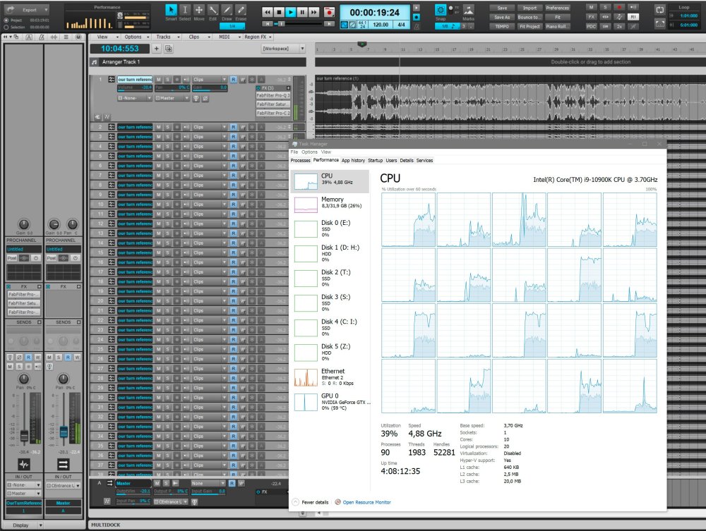
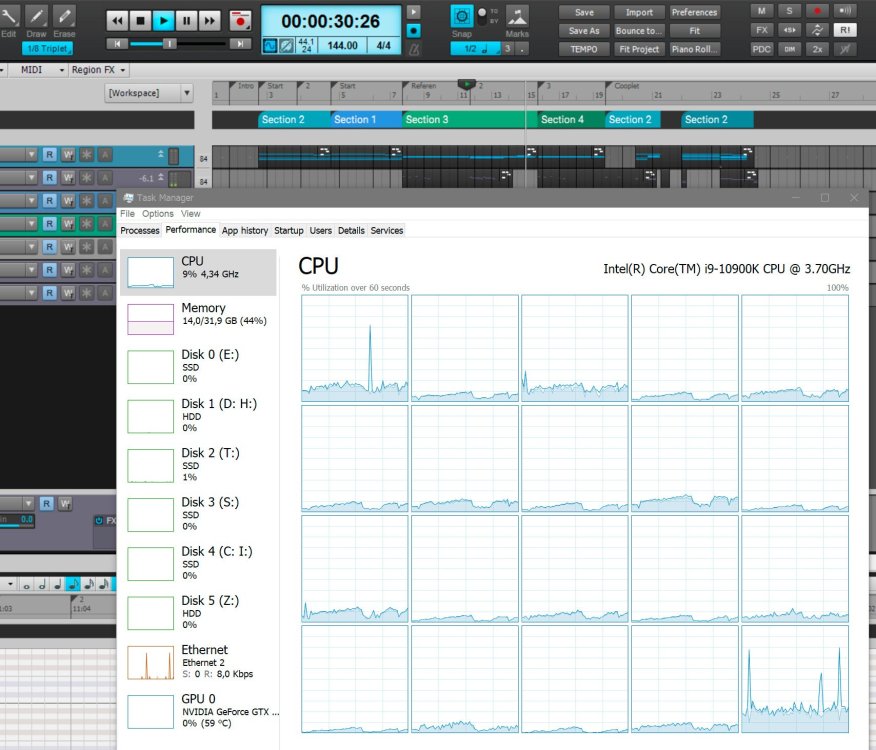
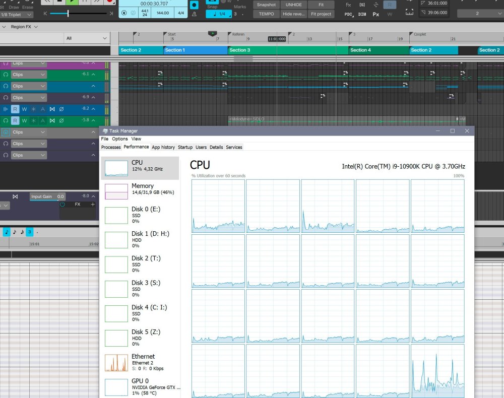
It is project specific indeed and how much more CPU Sonar uses than Cakewalk does vary but it's never less or the same, it's always more. Here's the simplest test I could think of and which you could easily replicate yourself - 50 copies of an audio track having FabFilter Q3, C2 and Saturn. The difference is staggering - 39% in Cakewalk and 59% in Sonar. Screenshots say it all.
-
Okay, then it appears that I have two absolutely different but somehow anomalous computers who always show in Task Manager that Sonar uses more CPU for each of my projects using the same settings in both Sonar and CbB. Quite well may be I'm an absolute minority here but I don't really believe I'm the one and only with such behavior. Here are screenshots of playback in the both programs at the same time stamp, 9% vs 12% CPU, it's about the same for any other of my projects. P.S. I just noticed on the OP's screenshots that during playback CbB runs at 3.91 Ghz and Sonar plays back at 2.40 Ghz. Might mean something, that's a substantial difference.
-
It's true that Sonar can handle more low latency synths than Cakewalk, but in any of my projects where number of synths is not too high and most load comes from VST effects, audio tracks and just a few synth, no single project uses less CPU in Sonar, it's always either a little bit higher or sometimes around 20% higher.
-
It's just Sonar uses more CPU than Cakewalk for the same project. If a complex project in Cakewalk is on the verge of crackling but still plays fine, it may not play well in Sonar and start to dropout there. No settings could change that.
-
Why? He's talking about the track colors. I'm talking about the general interface colors.
-
More contrast needed, look how immediately much more readable and easier on the eyes the whole thing becomes with just one simple slider move in Photoshop
-
Although the vectors in Sonar are probably simple SVGs which isn't hard to customize if there was a theme editor, what I believe he rather means is customizing just color themes leaving vector graphic elements alone. Would be a huge thing in itself considering the current uneditable color choices are subpar.
-
Point taken. The vinegar is there because I do care, been a Cakewalk user since 90s. It's just painful to see where it's going _compared_ to the free Cakewalk we've already have. The Cakewalk is the honey, but they want now money for vinegar.
-
All tastes are different, I completely agree. But there are things of preference (I've seen themes with green text on fire red BG and the guy was proud of it and had no troubles working with it), and then there are BASICS. The clips in the track view are one of the most important things (if not the) to work with in a DAW. Now look at the track view clips of the most used DAWs on the market on my screenshot, and then a light and dark theme of the same in Sonar. How anyone in his right mind could decide that clearly seeing clips in the track view is not important? It's not the matter of taste, it's a matter of professional incompetence.

-
And while we're at it, you've already reduced enough contrast making various BGs a shade of grey, that sure is easier on the eyes than pure white BG. But don't reduce it further by making dark text a shade of grey too, make it BLACK, don't be afraid of black text. Readability is the priority, not some hipster choice of shades of grey so it doesn't distract from whatever. Readability.
-
This whole thing is a disaster, why there's a random black window in a light theme?The person responsible for UI colors clearly has no any clue about UI design. Please give us back the customizable colors and stop torturing that UI guy
-
I guess it's these ones, black on darkest grey. The harder to read, the more improvement there is, it looks like.
-
It does however it's basically unusable due to extremely low contrast. For some reason they think a light theme means everything is a shade of light to the point it's unreadable. It is easy on the eyes though if you don't need to work with it and just prefer to stare at nice pastel colors.
-
I would join this request but on the contrary I need light menus everywhere. This only means we need our fully customizable UI colors back asap, BandLab's attempts at providing universally accepted color schemes keep failing, some color decisions are beyond any sensible design guidelines.