


-
Posts
4,881 -
Joined
Posts posted by User 905133
-
-
1 hour ago, Brian Lawler said:
NEW Modules
25 exciting new modules have been added to the library. Filters, saturator, crusher, logic gate, splitter, crossfader, mid-side, waveshapers, pitch shifter, panner and more.
41 minutes ago, SmokeyJ628 said:EDIT: Note that the list above is ALL of the updates from CV-1. The only updates in 2.2 are the 6 new modules AFAIK.
Asking for clarification of this ^^^^. Are you saying that 25 new modules were added to CV-1 but only 6 of those are new to CV-2?
-
-
-
-
-
-
24 minutes ago, Bruno de Souza Lino said:
Silence is consent. I'm not the only person who thinks there will not be a perpetual license and this impression hasn't changed since the first announcement. If anything, it's just being reinforced considering the very first thing rolled out were subscription plans and when people ask about perpetual license pricing, they either get nothing or get non-answers.
This statement reminds of several times throughout my life when some individuals told me they were choosing to believe what they wanted to believe about what others said I did regardless of the truth.
Nowadays, sometimes I respond when this kind of thing happens, but many times I remain silent.
Your claim "Silence is consent" in my opinion is generally untrue.
33 minutes ago, Bruno de Souza Lino said:The ugly truth is better than a well dressed lie in this situation IMO.
JMO: This statement was included as an insult. You can choose to believe what you want without regard to the truth, but IMO you should not lob insults.
-
 1
1
-
-
29 minutes ago, locrian said:
I think this freebie was already posted last week (or maybe the week before).
-
2
-
-
8 hours ago, Aewon said:
In my cakewalk login has previous paid for version for download. I'm wondering which is the latest between sonar x1 and sonar professional?
According to this SONAR Professional dates to the era of SONAR Platinum, which came after the SONAR X1 product.
-
1
-
-
21 minutes ago, Sander Verstraten said:
Not interested in the Keyboard as I'm not a live musician. But are all those Artist Tribute Presets available in the regular Analog Lab Pro?
If you have the free version Analog Lab Play, you could try exploring the Tribute expansion packs (use the search term "tribute" here before your purchase (possibly on one of the 50% off sales) to see if they would meet your needs.
-
9 hours ago, Starship Krupa said:
Why do we get this kind of thing when people suggest adding a new way to accomplish something? "Nooooo, pleeeease, I like it the way it IS! Don't force me to learn a new way to do it!"
(1) I cannot speak for others. (2) If you are trying to claim this is my position, I highly recommend you rethink this in the context of my posts in this thread as well as in other related threads.
9 hours ago, Starship Krupa said:It doesn't have to be a complete overhaul of the feature or a rethink of the UX philosophy or a retool of the Markers module or view or any such thing.
(3) To be clear, I never thought (or said) that a "complete overhaul . . . ." was required.
(4) As regards the issue of adding additional methods/workflow options to delete markers, so far as I can see, I never opposed that. For example, see the "JMO" sections here:
On 4/24/2020 at 8:02 AM, User 905133 said: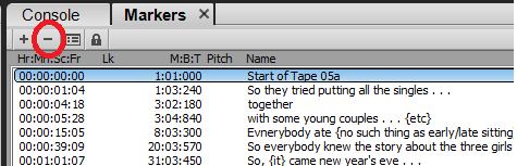
JMO: If there were a delete marker button in the Markers Module, it would be too easy to accidentally delete a marker.
Right context menu for modules seems to relate to the modules, not the functions within the modules.
JMO: If there were a delete marker button, it might be helpful to have an optional "Are you sure?" pop-up that is on by default, but could be turned off with a preferences settings. This would benefit both people who make mistakes and those who don't.
-
1
-
-
44 minutes ago, Sridhar Raghavan said:
In my technical parlance, I would say this (rather exaggerating and stretching to make a point) that your point of view is tantamount to system saying "Read My Mind" and if you (whatever type of user you are) are unable to do so, you are rather Dumb.
Thanks for starting the discussion and for your very thoughtful replies. I would agree that anthropomorphizing the software to be saying "Read My Mind and if you can't you are rather Dumb" could be considered as a bit of a stretched exaggeration.
For what it's worth, yesterday I wrote up the following and decided not to post it. It was in my edit buffer, and after seeing all the new comments thought it might be good to include:
QuoteSo, I tested what happens if I hover over a marker that hasn't officially been selected (as described above) and pressed Del in the case where there is a section of audio selected somewhere else in the track. The delete operation deleted the audio that was selected (instead of the marker).
If this happens, it seems to me that holding the left-click button down to make sure only the marker is selected is a good thing to avoid deleting a section of the track not in view.
I can easily imagine that changing the current procedures (described above), so that a marker can be deleted without having to select the marker (by holding the left click button down to delete) might accidentally introduce what could be called a "regression bug."
To be clear, what you call my "defense of the status quo" was not merely for the sake of just keeping the status quo. In my view things should not be kept, changed, or removed simply for their own sake independent of consequences, functionality, etc.
-
27 minutes ago, bertus weyers said:
Instead gave me a message "not enough memory as warned by Windows" or something to that effect.
In almost 100% of the cases where I saw that message, another piece of software (such as a utility program) was using the port.
TIP: You can put a phrase in quotation marks in the Forum Search Bar and set the scope to Everywhere. Here are the results I got from looking up "not enough memory."
There might be other causes. Also, you can look for posts from people whose explanations you like.
-
3 hours ago, Sridhar Raghavan said:
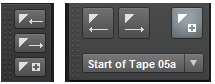
When you take the cursor to/near a marker, you get a Double Vertical Line, with left and right pointing arrows on both the sides, and letter M appearing to the right above . . . .
While keeping the Cursor on it, press delete.. the marker gets deleted.
It is an interesting UI but I would have never found this behavior on my own.. except after reading some frustrating post threads on this topic from few years ago.
Why not support the Normal UI Practice? Curious
Sorry, I still don't see what the problem is. I used the markers extensively several years ago to mark up several digitized oral history tapes. Part of the process involved entering the words of the speaker [and sometimes comments] to mark potential edit points. When the initial or added markers needed to be moved, it was a simple task to left-click on the flag at the top of the marker, hold the mouse button down, and slide it left or right.
To me, the parallel vertical lines with the left- and right-pointing arrows is a very sensical icon that let me know when I had grabbed the marker and it was safe to move it.
Maybe it took me a few tries to get it right the first time, but after that I had acquired eye-hand coordination that I didn't have to think about the meaning of the lines+arrows.
Holding the left mouse button down means that marker is selected for whatever action I want to take. Most of the times it was sliding the marker left or right. But if I wanted to delete the marker that was selected, I could press the Del key.
Sorry, but if you want to say something is or isn't intuitive, this is a poor example.
Intuition is based on one's personal experience. Experience isn't what happens to a person, it's what a person does with knowledge and understanding of those things the person observes.
To me after the first 3 or 4 times I tried, editing markers became transparent to my brain. My eyes saw the icon change, I automatically knew I had hold of the marker, and my hands did what I willed them to do (move the marker left, right, or deleted it).
The icon is intuitive to anyone who observes that the parallel lines+arrows allows them to do something with the markers--either move the marker left or right. Implied by holding the left mouse button down is selection (this item has been selected for some operation).
The Del button is commonly accepted to mean "Delete." Computer usage implies that a selected item would be deleted by pressing the Del button.
I suppose if the icon would switch between the parallel lines+arrows and a pair of scissors, you might say that would make the icon and process of deleting the marker more intuitive?
Sorry, but I think making the moving and deletion of markers more "normal" (whatever that would be--having to use a dialog box???) would be very destructive of what for me is a very intuitive process that maximizes workflow efficiency.
-
14 minutes ago, KSband said:
Seems like he's saying Cakewalk will not end, does he know something we don't?
It depends who you mean by "we." Some forum members knew from reading posts; some people might not have read the posts.
-
16 minutes ago, Sridhar Raghavan said:
It is an interesting UI but I would have never found this behavior on my own.. except after reading some frustrating post threads on this topic from few years ago.
Why not support the Normal UI Practice? Curious
Forgive an analogy: As a pedestrian I learned decades ago when crossing a side street that has a stop sign for cars, many drivers will look left to see if there are cars coming on the main road and then sweep their eyes right to see if it is "safe" from that direction and will totally miss that a pedestrian in crossing right in front of them.
In my opinion when people are learning robust software (such as Cakewalk/SONAR/CbB) many are like the drivers--looking to see where they want to go. However, the workflow road signs (very consistent and specific cursors) are there to help. Based on decades of experience, for me they are extremely helpful in navigating the software, though it is easy to ignore the signs.
Even though I have used the software since Cakewalk for MS DOS, when I teach myself new features, I find it very helpful to understand and pay attention to the cursor changes.
Hope this helps.
-
14 minutes ago, Sridhar Raghavan said:
Preface: This is a UI practice observation and I am hoping to get the rational/history behind from the long timers and developers.
When you take the cursor to/near a marker, you get a Double Vertical Line, with left and right pointing arrows on both the sides, and letter M appearing to the right above. (I thought I had captured the screen shot with that Graphic. But it does not show up as you can see below. Any tips on how to capture it on the Screen Shot?)
While keeping the Cursor on it, press delete.. the marker gets deleted.
Cakewalk/SONAR/Cakewalk by Bandlab uses a variety of cursors to clue users into many things, such as focus, working mode, possible actions, etc. I can't speak for the developers, but as a long-time user, paying attention to the cursor changes and developing an automatic/intuitive sense of the workflow based on the cursor changes is essential, helps navigate the robust UI, "paves" an otherwise bumpy "learning curve" for those who just want to speed through using the software by pushing the pedal to the metal, etc. I have found that automatic workflows (i.e., a sense of personal usage and "intuition") are made automatic because of the visual clues.
In my experience, Windows' built-in screen capture does not capture the various cursors. I don't know if there are third-party utilities that do.
-
1
-
-
-
So far the specific Browser enhancements mentioned are:
- A system of stars (or hearts or whatever) to have a one-click setting of "Favorites."
- Images of plug-ins, presumably in the browser lists/menus instead of icons to designate the plug-in formats (VST, VST3, DXi).
- Putting the search field in focus when opening the Browser buttons (Instruments, Audio FX, etc.).
Not agreeing or disagreeing right now, but I think if there are to be requests for enhancements it would be good to be specific.
-
So far the specific Browser enhancements mentioned are:
-
-
@Starship Krupa Is it possible you got it previously? I did, so I don't have an option to get a code for the reward. In my plugin boutique account, I used the search bar using "objeq" and there it was. I am pretty sure at one point I had two Objeq Delays, but my AAS account only has one license. I might have turned one in along with some duplicates several years ago for a deal on the full slate of AAS packs. Maybe someone else has a duplicate Objeq Delay for all your service to the community?
-
-
15 minutes ago, Cobus Prinsloo said:
I have already built up personalized workspaces, but now I have to start all over simply to get access to one viewing option!
You can edit/resave your existing personalized Workspaces to include the Navigator. No need to start all over building them.
To add the Navigator to the Views Menu:
Load a Workspace, Open the Workspace Manager, Open Views on the left side (Show in GUI), Put a check in Navigator, Save the Workspace.
The default Alt+N should work. Also, the Track View's View Tab will have the Navigator Show/Hide toggle/check mark.
I just took my "NO VIEWS" Workspace, enabled the Navigator View/Function as above, then used Alt+N to show the Navigator in the Track View and saved that. It worked for me.
-
3
-
-
57 minutes ago, Shaan said:
These days pretty much most software, apps and plugins comes with the way of tagging things on their Browsers as 'Favorites' and this certainly help with the workflow.
1. Give us an ability to easily and intuitively tag plugins, instruments and etc in the Sonar Browser to create a 'Favorites" list and an easy access to display them.
This will be an awesome addition to the Browser.
I don't use it, but I have played with the category assignment features. There's also the Cakewalk Plug-in Manager.
We can Sort by Category and choose to assign plug-ins to categories of our own choice--even one called FAVORITES. For example we can search the list for plug-ins by name and assign each to an existing category or use one of our own.
Even though I now prefer remembering my favorites either by Manufacturer or by Type, I found the features we have been given to be flexible and easy to use.
UPDATE: I found a few Instruments were listed as Uncategorized. As a test, I changed two to Favorites. Then I found two that were categorized as Synths and added Favorites to them (probably what you would call tagging?). So now those last two are still in the Synth Category, but also in my Favorites List.
-
1
-
-
https://www.scientificamerican.com/article/eclipse-glasses-fake-counterfeit/
QuoteHOW TO TEST WHETHER ECLIPSE GLASSES ARE SAFE
-
While lab tests are the best way to determine whether glasses meet the ISO standard, Fienberg says there is a three-part test people can do at home if they’re concerned their eclipse viewers aren’t up to the task.
- First, put your glasses on indoors and look around. The only things you should be able to see are very bright lights, such as a halogen bulb or a smartphone flashlight.
- Then, if the glasses pass the indoor test, bring them outside—but don’t look at the sun just yet. Look around: it should be too dark to see distant hills, trees or even the ground.
- If that second test is passed, keep the glasses on and quickly glance at the sun. You should comfortably see a bright, sharp-edged round disk.
- If your glasses pass all three tests, they are probably safe to wear.
- Fienberg points out that it’s best to use them for only a few seconds every minute or so during the eclipse;
- this cautious approach is how they’re intended to be used. And if you don’t trust your glasses for April’s celestial event, you could try to find a reliable pair in the next two decades. “You only have to wait 20 years for another really good eclipse year in the [United] States,” Fienberg says.
-
While lab tests are the best way to determine whether glasses meet the ISO standard, Fienberg says there is a three-part test people can do at home if they’re concerned their eclipse viewers aren’t up to the task.

AAS Multiphonics CV-2 Update Sale
in Deals
Posted · Edited by User 905133
to add an update
Hmmm. I didn't get an e-mail. Not sure if its because I already picked up CV-2 a few months ago (probably when I picked up the end-of-the year freebie) and there's nothing new for me. At the website, when I use the custom link, I only get an offer for non-Multiphonics Sound Packs.@Brian LawlerThanks for the clarification and for the link. Your post came in exactly at the same time as I figured it out from the website.
UPDATE: I didn't get an e-mail from AAS, because the offer is not from them. Its what Plugin Boutique is offering. Owners of Multiphonics CV-1 thinking about upgrading to CV-2 might want to see if AAS has/will be having a deal.
It looks like I chose a new CV-2 Sound Pack as my free gift in December and then (based on what I heard) I went for the Black Friday/Winter AAS Custom CV-2 Upgrade for $39.