-
Posts
15 -
Joined
-
Last visited
Posts posted by tunes4days
-
-
4 minutes ago, sjoens said:
For kicks I compaired Roboto-regular.ttf to XSRoboto-regular.ttf and there is a slight difference. I assume the XS variant is Cakewalk's version.
Subscription-based model: How would that work with a free program? As-is you don't have to update for it to continue working.
Thanks for checking that out!
At this point I'm assuming it is what it is wrt to the menus and that this may or may not change in the future. As I mentioned in a previous post, I have an extensive software background and I personally just have a hard time understanding how something like this makes it through for such a polished application. I really do. Others can think what they may or disagree as they see fit. Yes, I understand that CW is free though.
RE: subscription model... understood that you don't need to upgrade and can continue to use an existing version for as long as you like. That's a great thing! I was suggesting that a subscription model could be applied to a more rigorously tested, stable release channel and not that your software would expire at some point in time if you didn't continue to subscribe. The subscription model would just provide continued access to future updates via this channel. A subscription model allows for much more predictable and stable revenue stream with which to work vs one-time lump-sum payments.
What I'd REALLY enjoy seeing would the project be open-sourced, but not necessarily open-community. Bandlab maintains full control over new features, enhancements, and builds and releases to the public much like with Android from Google, but you can have access to the code to build and or modify yourself if you'd like to. In the end I doubt that will ever happen though since Bandlab did ultimately have to pay for the IP from Gibson and I'm guessing that it was not small change.
-
I rolled back to 2021.01 -- the last version I was on -- and all is well there. I'll try another update further down the road and see if this has been sorted.
Appreciate all the assistance and ideas!
-
For kicks, I tried copying that over to C:\Program Files\Cakewalk\Cakewalk Core and also tried right-clicking 'Install' to presumably install the font to Windows. No changes to the menus in CW though.
-
Did a bit more digging and I managed to find that file to which you referred but it's here and not in the Program Files directory. Thoughts?
C:\Users\Steve\AppData\Roaming\Cakewalk\Cakewalk Core\XSRoboto-Regular.ttf
-
4 minutes ago, scook said:
Cakewalk_by_BandLab_Setup_27.11.0.018.exe is a ~560MB full installer.
Try running this installer as administrator.
Correct, it is the full installer at ~ 560MB. Right-clicked and ran it as Administrator and the font file is not present. Menu font is still wonky.
-
7 minutes ago, scook said:
yes
Are you using BandLab Assistant or the Cakewalk Web Installer?
I updated to the latest version a few days ago via CW itself. I was prompted that there was a new version available at which time it downloaded the new version. I then ran that installer after shutting down CW.
Cakewalk_by_BandLab_Setup_27.11.0.018.exe
I still had the installer from 2020.11 thankfully when I came across the FX menu display issue. I rolled back via these.
Cakewalk_by_BandLab_Setup_26.11.0.099.exe
Cakewalk_by_BandLab_Update_Setup_27.01.0.098.exe
Now, to get to your question, to re-install the latest release again to confirm whether or not that font file was present, I simply re-ran the latest installer from above. Are you suggesting a different approach?
-
28 minutes ago, scook said:
Is the 177KB C:\ProgramData\Cakewalk\Cakewalk Core\XSRoboto-Regular.ttf installed?
No it is not. I just re-installed 2021.11 to verify. Would having this font present help? I can't find this particular font via Google but I did find Roboto-regular.ttf.
-
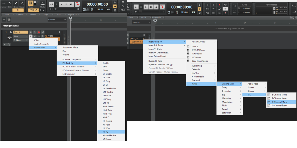
FYI here's the same comparison from above on 2020.11... so much cleaner IMO. I get that a lot of work has gone into the new menus to display the VST version in the right gutter (seen above) but they just don't look good at all IMO and there's such a mismatch from the rest of the application... needs work
-
I ultimately decided to roll back to the 2020.11 release I'd been using. Still works great for me and everything looks good! Thanks for all the help!
If this gets sorted at some point I'll try an update again.
-
9 hours ago, paulo said:
I see the OP's point. Looking on my laptop (win 8.1) whatever font they now use for the menus does seem to manage the quite unusual feat of being both bigger yet also less clear. First time that I've even looked at them TBH and it does seem a bit like change for the sake of change rather than an improvement.
Thanks for confirming. I just checked with another buddy that I know runs CW and he saw the same thing on Windows 10.
Anyway, I have a rather extensive software background and come across situations where stock UX elements don't fit the bill and you need to create a custom version if you will. Menus of various sorts can be just one example. Maybe they don't display icons where you'd like to have them or you can't tweak a particular aspect that needs to be tweaked to meet your needs, e.g. size, spacing, padding, foreground color, background color, font, etc. Anyway, I just noticed that the padding, background color, font, etc. varied quite a bit from the system-supplied stock menus so I figured this was a custom menu.
I'm just getting back into recording after about a year hiatus. New Dell Precision fixed workstation more memory and Xeon power than I should ever need, new Windows 10 Pro install, latest plugin updates from all the vendors I like, etc. I'm still sorting out which DAW I'd like to move forward with but CW has been my go-to for so, so long that I'd like to stay with it. Anyway, I've put a lot of energy into getting going again so I want to do it with a DAW that I'm not fighting with.
TBH, I wish Bandlab would launch a subscription-based model in which we can get less frequent, hardened releases. Keep the free releases for testing out new UX elements/changes, new features, etc. that are mostly stable/desirable while soliciting feedback. Keep the EAs for even more experimental/less stable work.
-
I recently upgraded to the latest release and noticed this...
Issue with fuzzy/blurry font for FX bin flyout menus only. The rest of the menus throughout the application render properly and are crisp and sharp looking.
-
 1
1
-
-
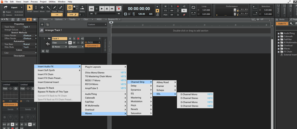
See below for normal system flyout menus from the 'Clips' combo box on the track on the left and the menus for the FX bin on the right. If you open and view at 1:1(make sure to zoom to 1:1 and/or fully open browser window) you can clearly see the distinction between what every other menu in CW looks like vs what the FX bin menus look like. If there's nothing that can be done then of course it still works. It's just a shame to see such a mismatch from the rest of the application when the rest of the application is superb. The font is so much larger and blurry/poorly rendered for the FX bin menus...
-
3 hours ago, User 905133 said:
The theme editor is useful for editing colors and images, not text-based fonts.
That's what I thought. I've never had a reason to fire it up in the past.
I tend to think that this is related to the software vs any Windows settings. I just tried another CW install on a brand new/stock Windows 10 with the same result. Very strange.
I tend to think that there is custom construction of these particular menus within the software vs them being standard system-supplied menus like we see in the toolbar and elsewhere in the application. The flyout menus from the toolbar which render properly, such as Edit -> Select, even have different arrow icons to indicate "more" menu to the right, aka the flyout. I also noticed the colored text for the VST version on the right of the plugin lists that seems to further suggest that these are being custom constructed since this isn't normally a rendering seen with standard system menus.
Any way to elevate this to the software team?
Thanks!
-
Just updated to the latest release version of CW from quite an older version and noticed the blurry/fuzzy and in some sense bolder font for the flyout menus from the track fx bin. All the rest of the menus displayed from the main toolbar and elsewhere in the application render clearly. Any ideas on the cause? The previous version didn't exhibit this problem. I don't have the theme editor installed but might I find something there? No system font scaling in place or any changes to display scaling. Running with a 24 inch Dell U2415 LCD display at 1920x1200(native resolution). Monitor is 16:10 aspect ratio. Nothing customized in terms of anything display-related essentially.
Appreciate the assist!


2021.11 Feedback
in Cakewalk by BandLab
Posted
Thanks for looking into this. I appreciate your time.
I am certain that the display is at native resolution and Windows is set to 100% scaling. Everything looks fine everywhere else with all fonts except for the new plug-in menus. If you see below, I've attached a comparison between the original style menus that still exist in various places throughout the application and the new plug-in menus that were introduced in 2021.04. To my eyes at least and a couple other folks that I've inquired with who run CW as well, the new plug-in menu font looks fuzzy and blurry compared to the original plug-in menu font. In fact, the screen grabs in the release notes for 2021.04 highlighting the new plug-in menus also -- again to me -- don't appear to be very clear and sharp like the original menus. I guess I just wonder if this is a different font for the new menus and if so which one? Can we have the old font with the new plug-in menus? Is there anyway to override the new menus? I noticed a "fix" in the release notes for 2021.06 which referred to a workaround for problems displaying the new plug-in menus which presumably reverted to the original menu style and/or font?